
Many thanks for your continued support and for your donations!
A few additional visual changes were implemented in preparation for Linux Mint 21.2.
Tooltips
We had been planning on redesigning our tooltips for a while. The main reason was that they lacked consistency and looked slightly different depending on where they came from (GTK2, GTK3, Cinnamon). They also featured a grey border which didn’t look clean around their yellow background.
Looking around us at other operating systems, Linux themes and what was done on the Web, we found that almost nobody used the traditional yellow color anymore. We tried a few things and eventually settled on what we think looks the best for us. Rather than using yellow, black or grey tooltips we decided to make them use the accent color.

We fixed the consistency issues across the various GTK versions and Cinnamon. We also took inspiration from Adwaita and made our tooltips bigger, rounder and with larger margins.
In Cinnamon we also added a bit of space between the applets and their tooltips so they wouldn’t be stuck to the panel.
Notifications
Cinnamon notifications will also be using the accent color.
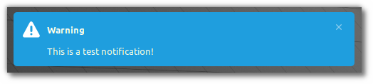
And whenever possible they will prefer symbolic icons.
Although these changes are quite small they continue to make the desktop look and feel cleaner and more modern.
In Linux Mint 21.1 efforts were made to make the accent colors more special, more vivid but less used. This continues this trend. Notifications and tooltips are transient elements which highlight an event or a feature. They should be beautiful and noticeable.
Secureboot
An update in Ubuntu’s shim-signed broke the compatibility of all Linux Mint (and past Ubuntu and derivative) ISOs with secureboot.
If because of this you are unable to install Linux Mint, for now we recommend to disable secureboot.
We are currently working on a fix for future ISOs and taking this opportunity to review the way we produce our images.
Upcoming Releases
We’re planning three releases for the Summer (or Winter if you’re in the South Hemisphere):
- Linux Mint 21.2
- An EDGE ISO release with kernel 5.19
- LMDE 6, based on the upcoming Debian 12 (set for release in June)
In order for all releases to get the 21.2 changes, they should come out in that order, with up to a month separating the Mint 21.2 and the LMDE 6 releases.
No ETAs have been decided yet.
Warpinator
Work continues on hardening the security aspects of Warpinator.
The tool recently received support for landlock and bubblewrap. These technologies were used to guarantee folder isolation, basically making Warpinator technically unable to write outside of its dedicated download folder.
Sponsorships:
Linux Mint is proudly sponsored by:
Gold Sponsors:  Silver Sponsors:   |
Bronze Sponsors:        |
Donations in March:
A total of $10,780 were raised thanks to the generous contributions of 393 donors:
![]() $250, Larry F.
$250, Larry F.
![]() $216 (3rd donation), Morten K. A.
$216 (3rd donation), Morten K. A.
![]() $150 (2nd donation), Adam S.
$150 (2nd donation), Adam S.
![]() $133, Michael N. aka “Django”
$133, Michael N. aka “Django”
![]() $108 (8th donation), Mimi
$108 (8th donation), Mimi
![]() $108 (4th donation), Nicolas H.
$108 (4th donation), Nicolas H.
![]() $108 (3rd donation), Mark H.
$108 (3rd donation), Mark H.
![]() $108 (2nd donation), Christian G.
$108 (2nd donation), Christian G.
![]() $108, Achim R.
$108, Achim R.
![]() $108, Jessica R.
$108, Jessica R.
![]() $108, Stan
$108, Stan
![]() $100 (7th donation), Ricky G.
$100 (7th donation), Ricky G.
![]() $100 (6th donation), Charles aka “Charley3”
$100 (6th donation), Charles aka “Charley3”
![]() $100 (4th donation), David T.
$100 (4th donation), David T.
![]() $100 (4th donation), Kevin L.
$100 (4th donation), Kevin L.
![]() $100 (3rd donation), Carl T.
$100 (3rd donation), Carl T.
![]() $100 (2nd donation), Curt B.
$100 (2nd donation), Curt B.
![]() $100 (2nd donation), Jason B.
$100 (2nd donation), Jason B.
![]() $100 (2nd donation), Joel H.
$100 (2nd donation), Joel H.
![]() $100, Danny T.
$100, Danny T.
![]() $100, Jeffrey J.
$100, Jeffrey J.
![]() $100, mattlongname
$100, mattlongname
![]() $100, Michael L.
$100, Michael L.
![]() $100, Trent I.
$100, Trent I.
![]() $98, Melvin C.
$98, Melvin C.
![]() $86, Monika K.
$86, Monika K.
![]() $69 (2nd donation), Tomáš R.
$69 (2nd donation), Tomáš R.
![]() $54 (18th donation), Naoise G.
$54 (18th donation), Naoise G.
![]() $54 (16th donation), Bjarne K.
$54 (16th donation), Bjarne K.
![]() $54 (4th donation), Christian D aka “zorbeck”
$54 (4th donation), Christian D aka “zorbeck”
![]() $54 (4th donation), Rolandas R.
$54 (4th donation), Rolandas R.
![]() $54 (3rd donation), Christian N.
$54 (3rd donation), Christian N.
![]() $54 (2nd donation), Marinus D.
$54 (2nd donation), Marinus D.
![]() $54 (2nd donation), Minty Kerman
$54 (2nd donation), Minty Kerman
![]() $54 (2nd donation), Stephan A.
$54 (2nd donation), Stephan A.
![]() $54 (2nd donation), Wulf N.
$54 (2nd donation), Wulf N.
![]() $54, Albert-jozef P.
$54, Albert-jozef P.
![]() $54, Christopher B.
$54, Christopher B.
![]() $54, Dominik P.
$54, Dominik P.
![]() $54, Duncan T.
$54, Duncan T.
![]() $54, Friedhelm K.
$54, Friedhelm K.
![]() $54, Guillaume V.
$54, Guillaume V.
![]() $54, Irene L.
$54, Irene L.
![]() $54, Jonas F.
$54, Jonas F.
![]() $54, Jonathan J.
$54, Jonathan J.
![]() $54, Jörn B.
$54, Jörn B.
![]() $54, Lukas S.
$54, Lukas S.
![]() $54, Markus B.
$54, Markus B.
![]() $54, Martin F.
$54, Martin F.
![]() $54, Patrick L.
$54, Patrick L.
![]() $54, Paul MD
$54, Paul MD
![]() $54, T.j. B.
$54, T.j. B.
![]() $54, Tim O.
$54, Tim O.
![]() $54, Vytautas R.
$54, Vytautas R.
![]() $52 (2nd donation), M. B. .
$52 (2nd donation), M. B. .
![]() $51 (2nd donation), Khan G.
$51 (2nd donation), Khan G.
![]() $50 (70th donation), Anthony C. aka “ciak”
$50 (70th donation), Anthony C. aka “ciak”
![]() $50 (7th donation), Rod Hassler
$50 (7th donation), Rod Hassler
![]() $50 (7th donation), Slowpoke47
$50 (7th donation), Slowpoke47
![]() $50 (4th donation), Martin Ch.
$50 (4th donation), Martin Ch.
![]() $50 (3rd donation), Peter S. aka “Pierre”
$50 (3rd donation), Peter S. aka “Pierre”
![]() $50 (3rd donation), Wayne R.
$50 (3rd donation), Wayne R.
![]() $50 (2nd donation), Chris C.
$50 (2nd donation), Chris C.
![]() $50 (2nd donation), Edward J. C.
$50 (2nd donation), Edward J. C.
![]() $50 (2nd donation), Francois B.
$50 (2nd donation), Francois B.
![]() $50 (2nd donation), Larry M.
$50 (2nd donation), Larry M.
![]() $50 (2nd donation), Niels B. aka “DetTårnHøjeHelvede”
$50 (2nd donation), Niels B. aka “DetTårnHøjeHelvede”
![]() $50, aka “The O.G.”
$50, aka “The O.G.”
![]() $50, Andrew B.
$50, Andrew B.
![]() $50, Davin S.
$50, Davin S.
![]() $50, Frank J.
$50, Frank J.
![]() $50, John R.
$50, John R.
![]() $50, Peter L.
$50, Peter L.
![]() $50, Rajesh S.
$50, Rajesh S.
![]() $50, Robert G.
$50, Robert G.
![]() $50, Robert J.
$50, Robert J.
![]() $50, Ron T.
$50, Ron T.
![]() $50, Rylen L.
$50, Rylen L.
![]() $50, Stephen C.
$50, Stephen C.
![]() $50, Thomas H.
$50, Thomas H.
![]() $50, Timothy R.
$50, Timothy R.
![]() $40 (5th donation), Juan V.
$40 (5th donation), Juan V.
![]() $40 (4th donation), William L.
$40 (4th donation), William L.
![]() $40 (2nd donation), Brian M.
$40 (2nd donation), Brian M.
![]() $40, Elizabeth R.
$40, Elizabeth R.
![]() $40, Richard S.
$40, Richard S.
![]() $40, zz .
$40, zz .
![]() $38 (3rd donation), Rüdiger A.
$38 (3rd donation), Rüdiger A.
![]() $36, Emily L.
$36, Emily L.
![]() $36, Theodore S.
$36, Theodore S.
![]() $35 (9th donation), Jeff S.
$35 (9th donation), Jeff S.
![]() $35 (7th donation), Ken W. aka “Tracknut”
$35 (7th donation), Ken W. aka “Tracknut”
![]() $35, Bob W.
$35, Bob W.
![]() $32 (10th donation), Lars-gunnar S.
$32 (10th donation), Lars-gunnar S.
![]() $32 (4th donation), Anthony G M.
$32 (4th donation), Anthony G M.
![]() $32 (4th donation), Ralf W.
$32 (4th donation), Ralf W.
![]() $32 (2nd donation), Johann S.
$32 (2nd donation), Johann S.
![]() $32 (2nd donation), Peter P.
$32 (2nd donation), Peter P.
![]() $32 (2nd donation), Söhnke H.
$32 (2nd donation), Söhnke H.
![]() $32, Carlo Z.
$32, Carlo Z.
![]() $32, Lothar L.
$32, Lothar L.
![]() $32, Pierre G.
$32, Pierre G.
![]() $32, Renato O.
$32, Renato O.
![]() $32, Torsten D.
$32, Torsten D.
![]() $30 (7th donation), Gene P.
$30 (7th donation), Gene P.
![]() $30 (4th donation), Daniel T.
$30 (4th donation), Daniel T.
![]() $30, Nikola Y.
$30, Nikola Y.
![]() $27 (18th donation), Hubertus B. aka “hubi”
$27 (18th donation), Hubertus B. aka “hubi”
![]() $27 (12th donation), Roger aka “GNU/Linux werkgroep”
$27 (12th donation), Roger aka “GNU/Linux werkgroep”
![]() $27 (2nd donation), Christoph M.
$27 (2nd donation), Christoph M.
![]() $27, Hc K.
$27, Hc K.
![]() $27, James F.
$27, James F.
![]() $27, Monika M.
$27, Monika M.
![]() $27, Stylianos C.
$27, Stylianos C.
![]() $25 (25th donation), Linux Mint Sverige
$25 (25th donation), Linux Mint Sverige
![]() $25 (14th donation), Vaughan Butler
$25 (14th donation), Vaughan Butler
![]() $25 (11th donation), Richard N.
$25 (11th donation), Richard N.
![]() $25 (8th donation), Carl J.
$25 (8th donation), Carl J.
![]() $25 (4th donation), Reuben N.
$25 (4th donation), Reuben N.
![]() $25 (3rd donation), Cheryl Meril, Notary Public
$25 (3rd donation), Cheryl Meril, Notary Public
![]() $25, Colin E.
$25, Colin E.
![]() $25, Rodney M.
$25, Rodney M.
![]() $22 (34th donation), Peter E.
$22 (34th donation), Peter E.
![]() $22 (20th donation), Per J.
$22 (20th donation), Per J.
![]() $22 (17th donation), Abdulkadir H. aka “Askari”
$22 (17th donation), Abdulkadir H. aka “Askari”
![]() $22 (9th donation), Steve Glyn.
$22 (9th donation), Steve Glyn.
![]() $22 (8th donation), L. Mikkel
$22 (8th donation), L. Mikkel
![]() $22 (7th donation), Ciaran M.
$22 (7th donation), Ciaran M.
![]() $22 (7th donation), Jürgen B.
$22 (7th donation), Jürgen B.
![]() $22 (6th donation), Stephen W.
$22 (6th donation), Stephen W.
![]() $22 (5th donation), Davide P. aka “Dragone2”
$22 (5th donation), Davide P. aka “Dragone2”
![]() $22 (5th donation), Joe S.
$22 (5th donation), Joe S.
![]() $22 (5th donation), Liviu B.
$22 (5th donation), Liviu B.
![]() $22 (5th donation), Marcel aka “schlegel11”
$22 (5th donation), Marcel aka “schlegel11”
![]() $22 (4th donation), Dominique M. O.
$22 (4th donation), Dominique M. O.
![]() $22 (4th donation), John T.
$22 (4th donation), John T.
![]() $22 (4th donation), Vittorio F.
$22 (4th donation), Vittorio F.
![]() $22 (3rd donation), Antoni Aloy Torrens
$22 (3rd donation), Antoni Aloy Torrens
![]() $22 (3rd donation), Fredrik E.
$22 (3rd donation), Fredrik E.
![]() $22 (3rd donation), Günther H.
$22 (3rd donation), Günther H.
![]() $22 (3rd donation), Luis D. R.
$22 (3rd donation), Luis D. R.
![]() $22 (3rd donation), Pavlos G.
$22 (3rd donation), Pavlos G.
![]() $22 (3rd donation), Richard W.
$22 (3rd donation), Richard W.
![]() $22 (2nd donation), Bruno Z.
$22 (2nd donation), Bruno Z.
![]() $22 (2nd donation), Christopher H.
$22 (2nd donation), Christopher H.
![]() $22 (2nd donation), Dirk H.
$22 (2nd donation), Dirk H.
![]() $22 (2nd donation), Ivan D.
$22 (2nd donation), Ivan D.
![]() $22 (2nd donation), Karl-heinz P.
$22 (2nd donation), Karl-heinz P.
![]() $22 (2nd donation), Peter W.
$22 (2nd donation), Peter W.
![]() $22 (2nd donation), Raul A.
$22 (2nd donation), Raul A.
![]() $22 (2nd donation), Rolf S.
$22 (2nd donation), Rolf S.
![]() $22, Albrecht H.
$22, Albrecht H.
![]() $22, Alexander R.
$22, Alexander R.
![]() $22, Christian J.
$22, Christian J.
![]() $22, Dieter H.
$22, Dieter H.
![]() $22, Gian Carlo G.
$22, Gian Carlo G.
![]() $22, Gunnar Bjørn L.
$22, Gunnar Bjørn L.
![]() $22, Gustav L.
$22, Gustav L.
![]() $22, Johannes B.
$22, Johannes B.
![]() $22, Julien G.
$22, Julien G.
![]() $22, Lydia B.
$22, Lydia B.
![]() $22, Malcolm S.
$22, Malcolm S.
![]() $22, Marko D.
$22, Marko D.
![]() $22, Michel B.
$22, Michel B.
![]() $22, Niccolo B.
$22, Niccolo B.
![]() $22, Nico W.
$22, Nico W.
![]() $22, Peter S.
$22, Peter S.
![]() $22, Robert C.
$22, Robert C.
![]() $22, Seppo K.
$22, Seppo K.
![]() $22, Serge J.
$22, Serge J.
![]() $22, Stavros S.
$22, Stavros S.
![]() $22, Steven H.
$22, Steven H.
![]() $22, Tim H.
$22, Tim H.
![]() $22, Valentijn G.
$22, Valentijn G.
![]() $22, Vilius C.
$22, Vilius C.
![]() $22, Werner S.
$22, Werner S.
![]() $21 (2nd donation), Matt H. aka “ermacaz”
$21 (2nd donation), Matt H. aka “ermacaz”
![]() $20 (62th donation), Rick R.
$20 (62th donation), Rick R.
![]() $20 (54th donation), Bryan F.
$20 (54th donation), Bryan F.
![]() $20 (42th donation), Stefan M. H.
$20 (42th donation), Stefan M. H.
![]() $20 (24th donation), vagrantcow
$20 (24th donation), vagrantcow
![]() $20 (13th donation), Dana S.
$20 (13th donation), Dana S.
![]() $20 (6th donation), Doug S.
$20 (6th donation), Doug S.
![]() $20 (6th donation), Harrison U.
$20 (6th donation), Harrison U.
![]() $20 (5th donation), Lal C.
$20 (5th donation), Lal C.
![]() $20 (4th donation), Brent P.
$20 (4th donation), Brent P.
![]() $20 (4th donation), Mark M.
$20 (4th donation), Mark M.
![]() $20 (4th donation), Robert M.
$20 (4th donation), Robert M.
![]() $20 (3rd donation), Glenn Meyer
$20 (3rd donation), Glenn Meyer
![]() $20 (3rd donation), John A. F.
$20 (3rd donation), John A. F.
![]() $20 (3rd donation), Marvin F.
$20 (3rd donation), Marvin F.
![]() $20 (3rd donation), Robert S.
$20 (3rd donation), Robert S.
![]() $20 (3rd donation), Ueda Y.
$20 (3rd donation), Ueda Y.
![]() $20 (2nd donation), Chad B.
$20 (2nd donation), Chad B.
![]() $20 (2nd donation), Christopher E.
$20 (2nd donation), Christopher E.
![]() $20 (2nd donation), Jean-francois B.
$20 (2nd donation), Jean-francois B.
![]() $20 (2nd donation), Lee R.
$20 (2nd donation), Lee R.
![]() $20 (2nd donation), Thomas D.
$20 (2nd donation), Thomas D.
![]() $20, Aaron H.
$20, Aaron H.
![]() $20, Allen L.
$20, Allen L.
![]() $20, Andrew F.
$20, Andrew F.
![]() $20, Anon
$20, Anon
![]() $20, Anthony W.
$20, Anthony W.
![]() $20, Charles C.
$20, Charles C.
![]() $20, Daniel S.
$20, Daniel S.
![]() $20, Francis B.
$20, Francis B.
![]() $20, Geoff C.
$20, Geoff C.
![]() $20, Howard C K.
$20, Howard C K.
![]() $20, Joseph M.
$20, Joseph M.
![]() $20, Keith B.
$20, Keith B.
![]() $20, Mike W.
$20, Mike W.
![]() $20, Pablo J.
$20, Pablo J.
![]() $20, Paul H.
$20, Paul H.
![]() $20, Raymond L.
$20, Raymond L.
![]() $20, Robert G.
$20, Robert G.
![]() $20, Robert W.
$20, Robert W.
![]() $20, Ronald B.
$20, Ronald B.
![]() $20, Ronald H.
$20, Ronald H.
![]() $20, Tamas M.
$20, Tamas M.
![]() $20, Tarcisio P.
$20, Tarcisio P.
![]() $20, Thiago Juliano D.
$20, Thiago Juliano D.
![]() $20, William S.
$20, William S.
![]() $18 (2nd donation), Imre N.
$18 (2nd donation), Imre N.
![]() $16 (67th donation), Andreas S.
$16 (67th donation), Andreas S.
![]() $16 (50th donation), Michael R.
$16 (50th donation), Michael R.
![]() $16 (4th donation), Daniel H.
$16 (4th donation), Daniel H.
![]() $15 (12th donation), Fred B.
$15 (12th donation), Fred B.
![]() $14 (80th donation), Johann J.
$14 (80th donation), Johann J.
![]() $12, Paul A J.
$12, Paul A J.
![]() $11 (45th donation), Francois-R L.
$11 (45th donation), Francois-R L.
![]() $11 (35th donation), Daniel S.
$11 (35th donation), Daniel S.
![]() $11 (35th donation), Thomas R.
$11 (35th donation), Thomas R.
![]() $11 (12th donation), Tugaleres.com
$11 (12th donation), Tugaleres.com
![]() $11 (10th donation), Denys G.
$11 (10th donation), Denys G.
![]() $11 (9th donation), Ivan Stamenov
$11 (9th donation), Ivan Stamenov
![]() $11 (9th donation), Jarmo J.
$11 (9th donation), Jarmo J.
![]() $11 (6th donation), Mark W.
$11 (6th donation), Mark W.
![]() $11 (5th donation), Stefan P.
$11 (5th donation), Stefan P.
![]() $11 (4th donation), Kjerkreit Ytre, Anders Kiær
$11 (4th donation), Kjerkreit Ytre, Anders Kiær
![]() $11 (4th donation), Antonio John Ettorre aka “AJ”
$11 (4th donation), Antonio John Ettorre aka “AJ”
![]() $11 (4th donation), Massimo R.
$11 (4th donation), Massimo R.
![]() $11 (4th donation), Raphael G.
$11 (4th donation), Raphael G.
![]() $11 (3rd donation), Alf J.
$11 (3rd donation), Alf J.
![]() $11 (3rd donation), Mr A
$11 (3rd donation), Mr A
![]() $11 (3rd donation), Pavel P.
$11 (3rd donation), Pavel P.
![]() $11 (3rd donation), Ronald S.
$11 (3rd donation), Ronald S.
![]() $11 (3rd donation), Sean Y.
$11 (3rd donation), Sean Y.
![]() $11 (3rd donation), Sebastian H.
$11 (3rd donation), Sebastian H.
![]() $11 (2nd donation), Andre Toussaint aka “AndreT”
$11 (2nd donation), Andre Toussaint aka “AndreT”
![]() $11 (2nd donation), Arno W.
$11 (2nd donation), Arno W.
![]() $11 (2nd donation), Axel S.
$11 (2nd donation), Axel S.
![]() $11 (2nd donation), Carlo R.
$11 (2nd donation), Carlo R.
![]() $11 (2nd donation), Henry B.
$11 (2nd donation), Henry B.
![]() $11 (2nd donation), Luis C.
$11 (2nd donation), Luis C.
![]() $11 (2nd donation), Mario M.
$11 (2nd donation), Mario M.
![]() $11 (2nd donation), Mariusz B.
$11 (2nd donation), Mariusz B.
![]() $11 (2nd donation), Matu Teodor Ioan aka “Teo”
$11 (2nd donation), Matu Teodor Ioan aka “Teo”
![]() $11 (2nd donation), Roland F. aka “rofibelm”
$11 (2nd donation), Roland F. aka “rofibelm”
![]() $11 (2nd donation), S. W.
$11 (2nd donation), S. W.
![]() $11 (2nd donation), Sandu I.
$11 (2nd donation), Sandu I.
![]() $11 (2nd donation), Želimir S.
$11 (2nd donation), Želimir S.
![]() $11, Albert T.
$11, Albert T.
![]() $11, Andrea S.
$11, Andrea S.
![]() $11, Antonio B.
$11, Antonio B.
![]() $11, Csilla F.
$11, Csilla F.
![]() $11, Dario B.
$11, Dario B.
![]() $11, David H.
$11, David H.
![]() $11, Davide T.
$11, Davide T.
![]() $11, Fran P.
$11, Fran P.
![]() $11, Giorgio M.
$11, Giorgio M.
![]() $11, Henrik N.
$11, Henrik N.
![]() $11, Igor Tomasz G.
$11, Igor Tomasz G.
![]() $11, Jerome L.
$11, Jerome L.
![]() $11, Jonas H.
$11, Jonas H.
![]() $11, Juan Ramon B.
$11, Juan Ramon B.
![]() $11, Luciano V.
$11, Luciano V.
![]() $11, Marcus B.
$11, Marcus B.
![]() $11, Marko S.
$11, Marko S.
![]() $11, Nicola C.
$11, Nicola C.
![]() $11, Nikola D.
$11, Nikola D.
![]() $11, page aka “page”
$11, page aka “page”
![]() $11, Patrick B.
$11, Patrick B.
![]() $11, Paul A.
$11, Paul A.
![]() $11, Pedro Miguel
$11, Pedro Miguel
![]() $11, Peter C.
$11, Peter C.
![]() $11, Philippe J.
$11, Philippe J.
![]() $11, Piotr S.
$11, Piotr S.
![]() $11, Ralf W.
$11, Ralf W.
![]() $11, Roger Julius Felix D.
$11, Roger Julius Felix D.
![]() $11, Sascha M.
$11, Sascha M.
![]() $11, Sergej S.
$11, Sergej S.
![]() $11, Stefan J.
$11, Stefan J.
![]() $11, Stefan W.
$11, Stefan W.
![]() $11, Sten G.
$11, Sten G.
![]() $11, Thomas K.
$11, Thomas K.
![]() $11, Yevhen S.
$11, Yevhen S.
![]() $10 (84th donation), Thomas C.
$10 (84th donation), Thomas C.
![]() $10 (78th donation), Frank K.
$10 (78th donation), Frank K.
![]() $10 (31st donation), Philip Woodward
$10 (31st donation), Philip Woodward
![]() $10 (19th donation), Solar Panels Saskatoon
$10 (19th donation), Solar Panels Saskatoon
![]() $10 (16th donation), Aimee W.
$10 (16th donation), Aimee W.
![]() $10 (11th donation), William M.
$10 (11th donation), William M.
![]() $10 (10th donation), Michael P.
$10 (10th donation), Michael P.
![]() $10 (7th donation), Jeffery G.
$10 (7th donation), Jeffery G.
![]() $10 (6th donation), Andrei Z.
$10 (6th donation), Andrei Z.
![]() $10 (6th donation), Thevirtua
$10 (6th donation), Thevirtua
![]() $10 (6th donation), Vlad Gruetz (YouTube)
$10 (6th donation), Vlad Gruetz (YouTube)
![]() $10 (5th donation), Nathan G. aka “Interior Painters in Baytown TX”
$10 (5th donation), Nathan G. aka “Interior Painters in Baytown TX”
![]() $10 (5th donation), Ricardo C N aka “V”
$10 (5th donation), Ricardo C N aka “V”
![]() $10 (4th donation), casca de copiat
$10 (4th donation), casca de copiat
![]() $10 (4th donation), Cesar A.
$10 (4th donation), Cesar A.
![]() $10 (4th donation), Corey J.
$10 (4th donation), Corey J.
![]() $10 (4th donation), Daniel Greg aka “006.5”
$10 (4th donation), Daniel Greg aka “006.5”
![]() $10 (2nd donation), Alan S.
$10 (2nd donation), Alan S.
![]() $10 (2nd donation), Alfred A.
$10 (2nd donation), Alfred A.
![]() $10 (2nd donation), Eugene C.
$10 (2nd donation), Eugene C.
![]() $10 (2nd donation), Ian E.
$10 (2nd donation), Ian E.
![]() $10 (2nd donation), Ricardo S. C.
$10 (2nd donation), Ricardo S. C.
![]() $10 (2nd donation), Robert K.
$10 (2nd donation), Robert K.
![]() $10 (2nd donation), Ruslan N.
$10 (2nd donation), Ruslan N.
![]() $10 (2nd donation), Walter P.
$10 (2nd donation), Walter P.
![]() $10 (2nd donation), Zsolt T.
$10 (2nd donation), Zsolt T.
![]() $10 (2nd donation), Дмитрий С.
$10 (2nd donation), Дмитрий С.
![]() $10, Andrew S.
$10, Andrew S.
![]() $10, Anthony M.
$10, Anthony M.
![]() $10, Ash
$10, Ash
![]() $10, Bryan M.
$10, Bryan M.
![]() $10, casca de copiat
$10, casca de copiat
![]() $10, Christopher H.
$10, Christopher H.
![]() $10, David S.
$10, David S.
![]() $10, Douglas Y.
$10, Douglas Y.
![]() $10, Fred B.
$10, Fred B.
![]() $10, Gilberto L.
$10, Gilberto L.
![]() $10, Greg N.
$10, Greg N.
![]() $10, Hannes B.
$10, Hannes B.
![]() $10, Jason K.
$10, Jason K.
![]() $10, John D.
$10, John D.
![]() $10, John R.
$10, John R.
![]() $10, Kenneth P.
$10, Kenneth P.
![]() $10, Martin M.
$10, Martin M.
![]() $10, Michael C.
$10, Michael C.
![]() $10, Nick Gausling, Business Consultant
$10, Nick Gausling, Business Consultant
![]() $10, Pawan N.
$10, Pawan N.
![]() $10, Rebecca W.
$10, Rebecca W.
![]() $10, Robert A.
$10, Robert A.
![]() $10, Tarek E.
$10, Tarek E.
![]() $10, Wesley S.
$10, Wesley S.
![]() $9, Cameron S.
$9, Cameron S.
![]() $8 (2nd donation), Leonid B.
$8 (2nd donation), Leonid B.
![]() $154 from 41 smaller donations
$154 from 41 smaller donations
If you want to help Linux Mint with a donation, please visit https://www.linuxmint.com/donors.php
Patrons:
Linux Mint is proudly supported by 607 patrons, for a sum of $2,719 per month.
To become a Linux Mint patron, please visit https://www.patreon.com/linux_mint
Or maybe you can make the color of the folders match the accent color, so that they are blue by default?
He did, check the previous post
Secret-chest
He did, check the previous post
Am I right in understanding that in Mint 21.2 the standard folders will be blue, following the accent color?
I can’t find information about this, please take a screenshot of the information about this as you can
This is a false statement. The April blog post regards stripe removal because nemo colors not obvious. Nothing about accent color.
“The stripe was therefore removed, making the icons look similar to those from the Papirus icon theme, which they were based on.”
Papirus icons are 1980 earth tone. Quite modern, yes?
> charles, May 2, 2023 at 7:22 pm
This is a false statement. The April blog post regards stripe removal because nemo colors not obvious. Nothing about accent color.
Wrong. Now the icon theme will use the colour variant on the whole folder, so if you have blue icons the folders will be blue. It seems the standard will be cyan theme/sand icons, but you can change the folders to any colour and the whole folder will get removed.
Also, Papirus’ standard colour is a light blue.
Hello, Secret. Let us agree last blog post is ambiguous. What, exactly, will be default folder color? Now, certainly not Papirus standard. Papirus is not offered, but used as base for Mint-Y.
I would be thankful for two changes in next version of linux mint 21.2
1. ability to insert period with double space system-wide
2. ability to make folder with selected items (files) system-wide
These two features would really change Linux Mint to the best OS available.
Charles,
What color do you think the new standard folder should be?
Hello Nich. Linux Mint should default GREEN.
But, really, I worry more about meaningless change because the opportunity cost. The inflated attention to colors takes time away from practical enhancements. Like degnoming Muffin.
Hello Clem!
Thank YOU for your work! You’re literally making the best desktop available. I’m surprised more people don’t come thank you for your hard work. You’re amazing.
I’m really looking forward to the next update even if it’s just incremental changes. Linux Mint is my favorite distro and it just keeps getting better and better. Thank you Clem and team for making such a great operating system.
Also, will Mint-Y remain as the default theme for 21.2 Victoria or will it be Adwaita? Curious to know.
Hi Jason,
Mint-Y continues to be the default theme.
Sorry to say that, being partially sighted, I find the text on your tooltip example difficult to read due to poor contrast.
It’s poorer than white on dark indeed. That said these color contrasts were already checked, they’re the ones we’ve been using since 21.1 in selected widgets. Also tooltips and notifications aren’t usually verbose. They’re there to catch your attention on something and to do it quickly. It’s quite rare for them to contain a lot of text.
I share your sentiments, Ian. “Modern” themes and styles seemly translate to centrality and conformity, rendering them both ageist and ableist in the process.
Good for the coder. Bad for us old folk and with disability.
Top Dev, could we reach compromise and remove transparency on tool tips, please? That it may solve op’s request.
It would be great if there would be at least one “high contrast” option, i.e. at least one very dark or very bright “accent colour”. Not sure it this would look good – but readability is an important attribute of a theme.
@Clem and Team,
So it isn’t just me who’s been complaining about the evolution (read regressions) of Cinnamon. (over the years I’ve been noticing some regressions on MATE too and I guess the bloated heavy unergonomical culprit is GTK).
My getting old eyes and now Ian’s, confirming me that this Watching BabyTV On LSD visual trend looks “cool and modern” but in reality it fails who really has a bad hard time reading things.
“Looking around us at other operating systems, Linux themes and what was done on the Web, we found that almost nobody used the traditional yellow color anymore. We tried a few things and eventually settled on what we think looks the best for us.”
THIS is EXACTLY what is going wrong with the current visual theming trends. Everyone is jumping into the well and Mint is jumping too because they’ve all done it and we don’t want to be the only ones behind.
Please stop catering to the looks of Windows or MacOS just because it’s “the current thing”, if I want them I’ll use them, not Mint.
The old black on yellow background has a reason: it’s, at the same time, one of the best, soft and contrasting ways of activating the brain’s amygdala through visual stimuli to bring up the attention. There’s neuroscience behind this, not the visual bling bling trend to call up the attention by some sub-par two-digit IQ design student bragging he’s da best from the top of Dunning-Kruger’s Mountain. I know these social environments, these won’t be using Mint anyway.
Clem, I have full respect for you and for your hard work to bring us the Mint we love, but it’s time to delegate this issue and bring some actual UX Design guys to the table and do some actual studies on where Mint’s visual Ergonomics is tripping. I’ll be happy to give some feedback and even some telemetry.
Yes I’ve been ranting a lot because Mint is also my longtime ship I want to save and keep on.
If you are making notifications to use the accent color, please make this feature optional, maybe a checkbox “use accent color for notifications background” or something like that, because even though notifications should be noticeable, this blue accent color (or in other cases red accent color) might be too disturbing and will not look good, especially with white font color. In sound settings we have an option to change Notification Sound or even disable it completely if we don’t want to be disturbed by it, so I think here we should also have an option to stick with original dark grey/black color as it was before so it wouldn’t be too much disturbing.
This doesn’t look quite alright. Imagine a red notification contrasting with a reddish desktop background, toasts, notifications and tooltips are supposed to be neutral and preferably follow the base bg color or a variation of it changing only transparency at most, it makes text easier to read. In the previous post post you mentioned how Mint-Y became a less accented theme, well a big orange notification seems like the opposite. As always thanks for the good work and hope you take any of these thoughts into consideration
Hi Clem
Mint just keeps getting better!
Whilst you are doing the work on notifications, would it be possible to address the inconsistency with USB removal notifications?. When unmounting, ejecting or safely removing a USB drive in Nemo I get a notification “the drive can safely be unplugged”, If I right click the drive and select “safely remove drive” from the desktop I get an audio sound but no other notification and if I right click “eject drive” from the desktop, I get no notification at all.
There’s also a UX inconsistency between selecting “safely remove drive” via Desktop icon and “eject drive” elsewhere. The first one will unmount all partitions of the device and power down the device. While the second will only unmount the specific partition.
I like the option to completely unmount all partitions and power down the device, but the inconsistency between different menus is confusing and has tripped me up before. Maybe both options should be added to all menus, but only when there are multiple partitions on that device to avoid unnecessary inflation of menu items.
I like the yellow tooltips – I’ve not noticed any unpleasant borders.
Why not just keep them?
Clem – one thing to consider as far as the notifications using the accent color as a background: For those of us with less that perfect vision, it’s much easier to see white text on a dark or black background than white text on a bright color. I personally am having more difficulty reading your notification example than I do with the current white text on dark gray/black background. If you’re going to go ahead with that concept, can we at least be able to configure that back to the normal current version for vision accessibility, please?
Seconding this. Changing the color scheme of these elements should be a part of their corresponding accessibility settings.
I still appreciate the update though!
Hear ye! Hear ye!
You can use a different theme, maybe someone will mod the Mint-Y.
I did not catch that it was a theme-based feature. I thought it was a Cinnamon feature for all themes. I should have known better. My bad.
Since you’re redesigning themes, could you also please take a look at the issue with the dialog windows in both Mint-Y and Mint-X?
Github issue: https://github.com/linuxmint/mint-themes/issues/428
It’s practically impossible to use keyboard to navigate between window dialog options because the themes now lack any visual indication of which option is currently selected.
Thanks to the team for continuing to improve Mint!.
For LM21.2 could you implement to be able to sort the search results from the Software Center? [that would allow to find the apps faster].
BTW Reading the comments about the new accents on the notifications, I wonder if you have considered the option of putting a white or black border to improve the contrast of the notification with the wallpaper.
PS. Please update Flatpak to a newer version that fixes certain security issues. Great job as allways!
Looks like the change from the ubuntu base to the debian base came closer and closer… 😉 I’m really looking forward to lmde 6! 😎
LMDE 6 so fast? I keep my fingers crossed!
With the acceleration of Debian releases you should seriously consider dropping the Ubuntu version. There would be time to refine the tools and the environment more thoroughly 🙂
LMDE is the best, really. Faster and more stable.
Fully agree. LMDE 5 is absolutely perfect. Why waisting time with the ubuntu version ?
Like another poster, I too find the tooltips – the ones shown in the blog post – hard to read (and my eyesight is not so bad). Surely readability matters, even for small pieces of text. A fix – but one that is hard to implement if the tooltip background tracks accent colour? – is to make the background a bit darker. Another – but complementary – fix is to make the foregrond colour, i.e. the text colour, brighter. That latter looks easy to do – because, at present, it seems that the text colour is grey-ish white; so you could make that colour a bright white.
I just bought a new motherboard (msi h510m pro-e) and I can’t install linux mint, it’s something I’ll have to investigate, I think it’s related to the “Secure Boot” issue. I love LMDE, I’ll be looking forward to the new version 6, many thanks to all the team.
P.S. I hope my message is understood, use a translator to write this.
If you’re on LMDE you might need a newer kernel.
Hello everyone. Ideally, the background and text color should be selectable in the theme panel. So each one could choose it to their liking and according to their vision. Not everyone sees the same way. In my case, light colors bother me a lot if they are in the background. This is why I use dark themes in everything I can.
If the theme of the notifications could be chosen at will, I would add it to the complete System because it would be more customizable and would not depend on the tastes of other people.
A more customizable system will always be better and this should be the premise of all developers.
I wish you all the best.
Agreed! I REALLY wish we had a fully implemented dark version of Mint-X, just for this very reason. I love Mint-X (THE best theme on any Linux distro), and I adore the the look of the partially-implemented dark version used in some of the dark themed apps, but it’s impossible to select it for everything. Sadly, the devs say they don’t want to maintain both a light and a dark Mint-X theme, as it’s not used by enough people. I hope my eyes can continue to handle it without having to switch to Mint-Y-Dark. I can’t stand Mint-Y.
I agree with many here that the contrast is really bad for those tooltips, especially in conjunction with the thin font. I don’t know which contrast checker you’ve used, Clem, but the one I use says NO.
https://contrastchecker.com
Thanks for this tool, Maren!
Oh yes, le old color selection wheel… I ‘member when we could use it on MATE to customize our desktop…
By the way, as neuroscience and evolutionary psychology claim, black text on yellow (#feff00 on that site) background gave almost the best possible contrast. Why? Our eyes are most sensitive on the yellow-green part of the light spectrum, and before nightfall it’s when colors start to fade away and dangers start to lurk out to nom nom on us. So our brains evolved to be more aware and responsive to this. It’s called mesotropic (or twilight) vision. I love to experience this while walking on the wilderness, it pops up some instincts on me.
Blue? That’s clear mid day sky when most predators are napping.
Too bad they don’t seem to be teaching this in design schools anymore, by the way everything desktop is regressing to childish saturated colors…
Should `South Hemisphere` be `Southern Hemisphere`?
https://en.wikipedia.org/wiki/Southern_Hemisphere
Thank you
Clem, it would be really cool if there was a way to automatically configure the repository faster in software-properties-gtk. Another suggestion would be a way to automatically remove the old kernel. There is this option in mintupdate, but it could be enabled by default.
At least here on Mint 20.3 MintUpdate leaves one old kernel version for safety and never removes manually installed kernels.
When a kernel update happens, they are all read again and this, on a device without an SSD, takes a long time
If you go to the update manager, under edit/preferences/automation you can set this to automatically delete old kernels (it keeps the current one and the last one). I agree reading all installed kernels can take along time if you have a lot installed, but activating the automatic option fixes that
What kernel is LMDE 6 going to have? If you know.
probably 6.1
I have rather poor eyesight and I think the accent colors will work as well as the current light yellow. I think using the accent colors is a great idea, it’s original and it’s never been done as far as I know. Looking forward to 21.2!
Clem,
thank you very much for the excellent distro!
I love it and it is my only OS.
One comment – Trash window in Nemo does not inherit properties from Nemo custom set properties. Namely, it keeps its own order of columns and does not display any icons associated with the content – just simply default red icons.
Not sure if this is a bug or a feature.
Will pipewire be default in 21.2?
Pipewire is included by default, it just needs enabled. I found instructions somewhere and I am using pipewire on Mint 21.
@exploder I too have enabled Pipewire as default for quite a while now. However PulseAudio is technically still (default) in Mint. I was simply curious if they were making the change on the next point release.
The accent colour makes Mint tooltips fresh and modern, it’s an innovative idea indeed. On the other hand, the “accessability” aspect of the interface suffers – the same happened when the systen font colour was light gray and folks with poor eyesight had reading problems. Tooltips don’t show too often, true, but when they do, they potentially carry important message to the user. That’s their function. Maybe it could be better if the accent color in tooltips was less dark and the text black instead of white? Or let the users decide?…
gtk4 for cinnamon would make everything more modern
Hi, the new tooltips are OK but pls improve the contrast. Now a different thing: I find inconsistency between uninstalling apps from the Linux Mint menu and from the software app. I can’t uninstall Libra Office from the menu because it says there are some dependencies I shouldn’t touch. I can uninstall using the software app. I guess it’s the menu that is buggy.
Using accent colours for the pop-up tooltips is a terrible idea, because the colours were changed and are now too bright to begin with, it literally makes you think why bother using the dark theme as it’s not very dark any more. May I please just have the old duller colours and shades back, or even a brighness control for the colours? If there is already a set of default colors, why can’t there be a color wheel to select the hue, brightness and saturation for yourself? Or a checkbox to use the old 20.3/21.0 look? The modern look is just too aggressive and even the new mouse icons make it feel like a toy. Back in the day, I usually waited for Linux Mint releases with excitement, now it’s like oh what horrible things they have done this time, changing the look and feel so radically,
We can’t please everybody but we try. The “old duller” colors you mentioned are available as a legacy theme. That theme isn’t only installed by default, it will be much easier to switch to in 21.2. It’s renamed Mint-L and you can switch to it with one click of the mouse in the new Cinnamon theme settings. The color wheel idea just isn’t feasible anymore. We need to account not only for GTK2 but GTK3, GTK4, Xfwm, Metacity, Cinnamon.. there are a variety of formats and image assets which are generated for each tint, they require source materials and development tools. You can make a custom theme by forking Mint-Y, but we can’t implement such a color wheel.
I really don’t understand why the colors of parts of the desktop have to be changed or changed back every six months. User tastes differ anyway, so why all these changes (that I personally don’t like)? I don’t want red tooltips.
Quite soon Debian itself will use the 6.1 LTS kernel. What are the reason that an upcoming new Mint release will still use 5.15 LTS?
There’s a HWE(HardWare Enablement) kernel that’s currently 5.19 for Mint 21 and there’s a Mint Edge ISO that uses the HWE Kernel and if one is using an earlier release of Mint that came from an earlier Edge ISO then even a Mint Update to the newer Mint edition will go from the Older Mint Edge version and HWE Kernel to the Newer Mint Edge version and the latest HWE Kernel. I’ve updated 2 of my systems(Laptops) from Mint 20.3( Edge) to Mint 21.0 and that Edge HWE Kernel became 5.19 upon successful completion of Mint Update to Mint 21. One can always choose to manually update to the Edge Kernel and even on my older Laptops, that were fine with the Kernel 5.4 and 5.15 LTS kernels, would always show the Edge Kernels available in the Mint Update View Linux Kernels Menu option. So Mint 21 is derived from the Ubuntu Jammy Jellyfish base and the Mint Kernels come via that upstream base. One can always get an even more up to date kernel variant but that’s not been as vetted for stability with the Ubuntu base or the Mint downstream derived Distro so use with caution there.
I’m certainly glad 5.15 is there, though. On my laptop (made in 2020, so not incredibly old), 5.15 works flawlessly, while 5.19 (HWE kernel) and 6.1 (OEM kernel) both give me hardware errors. So unless they can fix those errors, I may be stuck.
For folks tracking Mesa’s new OpenCL(Rust based) support how does that stand for Linux Mint and Mesa 23.0/23.1 that’s supposed to have the beginning of that OpenCL supported via the MESA Drivers so Linux GUI based applications that need GPU compute can utilize that? So software like Dark Table and Blender 3D(2.93/earlier editions) /others can utilize the GPU for compute acceleration(Blender Cycles Rendering on Blender 3D 2.93/Earlier editions). So currently that’s MESA 22.2.5 and I’m on mint 21.0. Does a certain MESA version ship with the Distro Base and it stays that way until a new Distro version arrives or will there be some newer MESA edition back-ported to the Jammy base?
Too much blue
Clem, here an idea, in addition to my comment regarding tooltip accessibility. Instead of making it just whatever the accent color is with white text, what if you made a new desktop setting for tooltip color. You can have it default to the accent color like you mention in those blog post, but when the user ticks a checkbox, it offers a color selector for both background and text. This would let the user decide exactly they look they want. If someone really wanted to, they could make it fuchsia text on white background, if they so choose, or in my case, I would select a good contrast, such as white on black or dark gray, or for the traditionalists, they could choose black text on yellow background. It seems like a very flexible option, and possibly not too difficult to implement (although I may be wrong on that – I’m fairly new on the modern coding end of things, but I am learning!)
I also would like similar functionality to apply to the color-accent notifications as well, not just tooltips.
It’s not practical. Look, if we had our own toolkit and all apps were using it, sure, we’d think of solutions like the one you described. In practice though we’re composing with GTK, and not just GTK.. various releases of GTK, and additional toolkits around it. These are not customizable at runtime.
The best way we found to please a variety of people right now is to offer both a vibrant new look and to continue to ship the old one. Coming up in 21.2 we also made it much easier/faster to switch between them. I understand some people don’t like the new flashy style, and they don’t need to, we’ve got Mint-L in there looking just the way Mint did a few releases ago.
I see. So this is a theme feature. I was thinking it was a feature of Cinnamon itself, independent of the theme. That’s fine then, as I don’t use Mint-Y anyway. Thank you for the clarification!
Hi Clem, Mint Team, I’m looking forward to an even more improved Linux Mint Cinnamon!
Will there be improvements for the Update Manager?
E.g. a clear hint if a user tries to do manual update while a automatic one is running in background?
Or a mechanism which shows the information when the update list (apt update) was created to understand if it might be not up-to-date anymore?
These both things confuse my – not so technical experienced – users from time to time.
Hi Henrik,
There are a few improvements: https://github.com/linuxmint/mintupdate/commits/master. We’re also adding the ability to disable flatpak/cinnamon support.
Regarding automated updates, we added a monitor a few releases back.. i.e. whenever timeshift snapshots or automated apt updates are running, a systray icon appears in the panel to indicate what’s going on. Mintupdate itself monitors the state of the APT cache and refreshes it at regular intervals (this is configurable). If you happen to launch an update while APT is busy, it will just show you an error message to explain what’s going on.
Hi Clem, thanks for your reply.
“My” users – those with manual updates – often are aware of the necessity of regular Security updates – so some of them update directly after the system has started, but this can happen when the update list was not yet refreshed by the update manager! So they see/install “old” updates which might be obsolete meanwhile – e.g. if a package was updated twice in a short period of time or if the last update of the list is several days ago.
As a result they will get an error message and be confused. To resolve they have to refresh the Update Manager’s list manually or wait until the refresh automatically happens.
So maybe a mechanism which verifies if the Update Manager was opened by the user:
1. The first time after the system has started
AND
2. The automatic refresh of the update list has not yet taken place
It shall do the refresh immediately or don’t show these – potentially – old updates with the hint to refresh the list manually or wait till it is refreshed automatically.
Cheers, Henrik
Hi Clem,
if you are working on the tooltips, please have a look into this bug:
https://github.com/linuxmint/cinnamon/issues/11155
Tooltips on the panel stop working entirely after some time. I can reproduce it if I disable “Group windows by application” in the “Grouped windows list” applet and close for example one of two Firefox windows with middle mouse click on the application in the panel. After that there are no more toolstips shown on the panel.
Thanks for your good work!
Hi Elliot. I’ve been suffering from this behavior for a long time and couldn’t pinpoint it to some particular action; tried to close a program from the grouped window list and that triggered it but I’m sure is not the only way. The only solution to get it back is restarting cinnamon, very annoying.
After switching to the old window list combined with starters in the panel, the problem completely went away for me. I think it has to do something with the grouped window list applet.
Thank you for the great news that LMDE 6 will be released “up to a month” after 21.2. Thank you also for the changes to the tooltips – I’ve been waiting patiently for this.
I would like to see an ability to ‘save my custom theme’, every attribute of it, so that I can reset to default, and later ‘restore my custom theme’. If such a tool exists I have failed to find it. I have searched applets, desklets, and various other places that I cannot remember them all.
Am I missing something ?
I love Linux Mint! I am currently up to date with 21.1
One small quirk I notice when booting my 2013 Macbook Pro with charger disconnected – the battery percentage charge displayed at the top of the login screen shows 10 or more decimal places…
A może tym byście się zajeli w końcu, an nie ikonam,i kolorami itp. A i tak Mint wygląda staro nawet bardzo. Choć doceniam bardzo pracę zespołu Mint. To odnoszę wrażenie, że robicie rzeczy mniej ważne a zajmujecieie się rzeczami mniej ważnymi.
1. Podczas kopiowania np. dużej ilości zdjęć z komputera na pendrive znika pasek kopiowania, co sugeruje, że kopiowanie zostało zakończone, co nie jest prawdą, ponieważ kopiowanie na pendrive nie zostało zakończone. Czasami kończy się to uszkodzeniem danych na dysku flash.
2. Komputery mają włączone automatyczne aktualizacje systemu. Jeżeli komputer jest w trakcie aktualizacji systemu i użytkownik chce w tym czasie wyłączyć komputer, dostępna jest tylko opcja uśpienia komputera. Nie ma opcji „Aktualizuj i zamknij automatycznie po zakończeniu aktualizacji”.
Or maybe you’d take care of that in the end, not icons, and colors, etc. And even so Mint looks old, even very old. While I appreciate the work of the Mint team very much. It gives me the impression that you are doing less important things and dealing with less important things.
1. When copying, for example, a large number of photos from the computer to the flash drive, the copy bar disappears, which suggests that the copying has been completed, which is not true, because copying to the flash drive has not been completed. Sometimes this ends up corrupting the data on the flash drive.
2. Computers have automatic system updates turned on. If the computer is in the process of updating the system and you want to turn off the computer during this time, only the option to put the computer to sleep is available. There is no “Update and close automatically when update completes” option.
Do not unplug your USB drive. Right-click on it in the file explorer side panel, then select “Eject”. This forces the file system to flush the copy operation. It will tell you “Writing data to USB… device should NOT be unplugged.” Then you have to wait 1-2 minutes. When the flushing operation is finished, it will give another notification: “device can be safely removed.” Then you can remove it.
Unfortunately this is how it is on Linux. It happens on other distros too, it’s not special to Mint.
I use LM21 MATE with Caja file manager. I never trust the pop up notice that it is safe. I always bring up a terminal and run “sync”. Only after that completes do I consider it safe to pull out the USB or unmount any other drive.
The OEM install selection needs to be returned to the LMDE ISO boot menu. As I remember and near as I can tell ( just now verified with VirtualBox ) it was left out of LMDE 5 version.
Also, LMDE should be included in the “Choose the right edition” section of the linuxmint-installation-guide on line documentation. Too often, many do not appreciate and understand its importance in development of LinuxMint.
I’m not sure that using the accent color for notifications is a good idea. It looks passable with smaller notifications, but it is definitely going to be a pain with huge notifications (such as discord which insists on sending a 2k character message in the entire notification…).
I’m generally not a fan of the use there, and would prefer that tooltips and notifications use the same background as the theme (dark for dark themes, light for light themes). Hopefully it’s just seeing examples isolated from the rest of the UI that’s making me trip up a little.
Truth be told. My gut feeling on this is that this is an improvement but I’m not 100% sure about it. It is risky and it is subjective. I think it’s something you need to try before you can form an opinion. I’ve been running Mint with accentuated notifications and tooltips for about two weeks now, and I like it.. but not to the point when I’m 100% sure it’s the way to go. I think what we’ll do is go ahead with this, at least until BETA so we can gather feedback from people who experience it.
It’s a minor change but it significantly changes the look and feel and makes the DE feel cleaner and more modern. I want to give it a try and let people experience it. At the same time, if after BETA people don’t like it, I’m open to reverting it, we’ll see.
With 21.1 we already went out on a limb with the vivid colors and it paid off. This is going a tiny bit further in the same direction. Shipping with legacy themes, and now in 21.2 making it even easier to select legacy themes, makes this a safe bet, so I want to try it.
Clem, my gut feeling on this is that this is not an improvement.
Clem, just give us both options and we will set it how it suits us.
Clement, Warpinator maybe works better if it stays in Nemo as Airdrop works in Finder on the macOS, simpler.
Thanks, Clem and team, for all your work.
A hopefully easy request for you:
Could you get SUCURI to stop blocking me (or my VPN? or my privacy-focused browser?) from accessing Mint sites? There are quite a few reports of this annoying behavior in the community forums. I can get here by an anonymizing link, but it’s still an exasperating obstacle.
Thanks!
Morning!
Pleased to see you, as always, dedicated to further improve the desktop experience. So here is some user feedback for the planned changes: personally I do not use notifications that much but as long as it is easy to read a bit of colour might be exciting. As far as the tooltips are concerned however I would implore you to not futz with them ore at least give us a fallback option to keep the current one with otherwise up-to-date themes. The current version is simply easy to read and looks pleasing with every application and theme I tried so far(quite a few;-)) without ever getting annoying or blending into the background. In fact, one the main reasons I still use the old window- list applet instead of the new, grouped one, is that the later does not default to the yellow tooltips when you deactivate the window preview and stacking of applications- white on black window selection popout is visually not attention grabbing enough for me and does not display a much information due to space restrictions.
My personal top priorities for a redesign would be to:
… make the folder/file emblems (especially the ‘link’-emblem) in nemo smaller and maybe partly transparent so they do not obstruct the folder/file Icon so much.
… group the applications in applications in mintinstall in a way that is more read- and discoverable in mintinstall. The current form is very annoying to use. I would suggest a 2- column limit max. with alphabetical sorting by default. More sorting/filter-options would be appreciated.
… Install ‘nemo-image-converter’ by default. The high resolution of current phones/cameras and the resulting file size simply does not correspond with the usual e-mail size restrictions so basically everyone needs a quick image-size restriction once in a while and having that available in the right click menu is convenient.
Best of wishes and have a nice day folks!
Sorry to say this, but that is a terrible decision. Those tooltips and notifications look horrrible and hard to read.
The yellow tooltips have a good contrast (soft background, black text) and similar for the notifications (gray-black background with white-gray text).
This new ones just hurt the eyes to look that.
At least I hope we can choose between the old and new ones.
Yes. Being able to choose would be the best way!
This is how i’m going about Mint Y at the moment
https://github.com/axel358/mint-y-theme-tweaks
I’m still on Mint 20.0 but noticing that the windows and their Drop Shadows/Shadows are not always applying the Blur radius properly in the compositor and can sometimes appear to oscillate there between a proper shadow effect and one that’s not properly rendering the way is supposed to. And I’m noticing this most when Mini Update is being used and when the status/downloading-applying smaller window floats above the larger Mint Update window there. And that oscillating between the Drop-shadow/Outline-shadow effect that’s supposed to have a slight blur and slight alpha applied to give that floating effect there and some not so proper shadow effect.
I have noticed this as well. It’s almost like the “good” drop shadow uses the full spectrum of transparency colors, but the “buggy” drop shadow uses fewer gradient steps or something. It’s really odd. And yeah, it can be often seen when a smaller dialog box comes up over the larger window, and then the larger window’s shadow goes into the “buggy” mode, and doesn’t go back to “good” mode until the dialog box is gone. This has actually been around for quite a long time. Long before LM 20 came out. Maybe even before 19. I don’t remember when I first saw it happen. I’m sure there’s gotta be a bug report on it, unless it’s just been overlooked.
Hello,
thank you very much for your wonderful work!
Since I have no idea how high your running costs and liquidity are, it is difficult for me to estimate how much I should donate. I would like to split my donation amount optimally for various projects.
If it is not too complicated, it would be great if you could not only state the monthly donations, but also the current liquidity and the average monthly costs. I think that would certainly be in the interests of all donors.
I look forward to your feedback and wish you continued success!
Would there be a Benefit in having FireJail installed as a Default application?
Just another thanks for the continued work on LMDE. I look forward to the hopeful day when LMDE is considered the primary edition of Linux Mint. LMDE 6 will no doubt be outstanding. For now, please at least promote it and list it on all the same pages where the Cinnamon, MATE, and Xfce versions are listed. LMDE is a gem and it deserves more press and visibility. In any case, thank you to the LM team for their hard work!
Lorsque l’on manque de place dans le répertoire racine, il peut être utile de remplacer un sous répertoire par un lien symbolique vers un autre volume (disque ou clé USB de grande capacité). Avec la commande en ligne “ls” dans le terminal c’est possible, mais pas pratique. Ne serait-il pas possible dans le menu déroulant d’un répertoire ou d’un fichier à côté des options “couper” et “coller” d’ajouter l’option “remplacer par un lien symbolique” et de coller ensuite la cible du lien à l’emplacement souhaité ?
Hi Clem , i found a bug on cinnamon, if you use jdownloader2 only on Cinnamon the application make an other icon on desktop and you can use that program only with no tray icon … please help me
Dear mint team,
I’ve made some changes on the graphical mintupgrade application to improve orphan package management. It may have uncleaned the code and now the separation between the backend (checks.py) and the frontend (mintupgrade.py) is a bit “messed up”, so it’s a bit mixed up, some frontend stuff checks.py, but can you maybe still look at it and tell me if I should make some changes? Here is the patch with my changes: http://paste.debian.net/1280708
Thank you!
Maybe one should check the packages to remove and not to keep. Just tell me if anything needs to be changed! 🙂
Thank you for your efforts to make Linux more useful. I found Mint is way better and more stable than the rest. The only bug I noticed (OR maybe not a bug). Timeshift is still listed (as First Steps > System Snapshots) in the welcome app even after I remove it from the system. It doesn’t do anything when I click, but ideally, it should be also removed from the welcome app if Timeshift is not installed.
Hallo Leute, habe eine Frage wie Lange bekommt man die updates für LMDE5 32bit.
Bin neu in der Linux Welt. Wer kann mir da weiterhelfen
Danke
Hi Mint Team,
when using the tor-network, acces to your site is denied by sucuri.
I tried with several systems.
Is this intended ?
Thx for all your work
Dear Clem,
I realize, I do have sometimes weird wishes. My hope is, that this time it would be something that would not only benefit myself but everyone else, having the same issue.
Speaking of colors, have you noticed, that when you use the Mate mint-y-dark theme and like me, you use the sticky notes, that come with the Mate-panel and for nostalgic reasons, you thought, hey that yellow would fit really nice to the dark gray, so I did set those sticky notes back to yellow.
So far, so good. Looks exactly like I thought it would. I did it by deselecting “use colors from system theme” in the sticky notes preferences.
I am a very lazy fella, so I put most of my terminal command, that I need regularly on those sticky notes, so I just mark and paste them as I need them.
And here is my dilemma – that yellow looks just perfect with all that dark gray all around, but whenever you mark a line or even just a word, you cannot see it. The text that you mark or not is the same color as the note, so you cannot see if you marked that word or command or how much. It is like you didn’t mark it at all.
However, going back to the dark gray notes, by reactivated the colors from the system theme will show all the text you marked in a nice looking blue-ish tone. That looks equally perfect. That blue-ish color is a nice separation from the system gray, and you can see it very easy.
My wish would be, that someone could take a look at the sticky notes color, when you didn’t select the colors from the system theme and maybe use a green or lighter gray for marking text on those sticky notes.
Don’t know about the rest of you, but I for one would LOVE to see someone fix the dual network/sound icons that keep showing up in the Mate panel??? This has been going on now for the past 3 or 4 releases and should have been fixed a long time ago.
Just saying……………….
The issue of color accents doesn’t seem like it’s going to make everyone happy, it’s debatable… maybe it’s more useful to leave it only for security notifications and system updates
Could you please take a look at the favourites star emblem? It’s hardly visible when placed on a yellow folder icon….
Clem, I’m late in thanking you for the monthly update.
A question I have is around the release of LMDE 6. I believe a summer release in 2023 is a change in the cadence of the last couple releases (roughly 7-8 months after the then-latest stable Debian base). This is a pleasant change, and I’m wondering a) what led you and your team to work on LMDE sooner and b) if this change will start a new release schedule moving forward.
Keep up the excellent work that you and your team work — and be sure to enjoy the summer months as well (or Winter for those in the South Hemisphere)!
At clem: wann hoerst du endlich auf mit dieser sucuri blockierei? Das ist ja wie im Kindergarten….
Could you please set up a Lightning address for your Bitcoin payments?
I’m really look forward to the multi threaded thumbnail generation in Mint 21.2
Clem, the “LM 21.2 EDGE ISO release with kernel 5.19” is not enough!!!
PCs with Intel CPU gen 13 has serious troubles to boot from USB stick with kernel 5.19. I think the kernel 6.x should be more proper choice.