
Hi everybody! Before we get started, I’d like to thank all the people who support us, many thanks to all of you for helping us the way you do.
We’ve got quite a bit of news this month and we’re eager to get your feedback.
Website Design
We’re working on a new design for our main website. When the current design (and logo) were originally designed they carried a strong identity and we grew quite attached to them. For a while now we were hoping to get a new unique design which would look brand new but still carry that very same feel, and that was very hard to achieve. In the meantime, we stayed with something that was stuck in the past and that just doesn’t work well nowadays. We’ve heard many people ask why our website looks so old, and I think it’s time we do something about that.
Rather than waiting forever for the perfect design, we decided to purchase modern looking designs which were based on Bootstrap and to use them to build something clean, that would work on all devices and that could be maintained and modified easily going forward.
Here is a quick preview of what we’re working on. Bear in mind that some elements are likely to change:
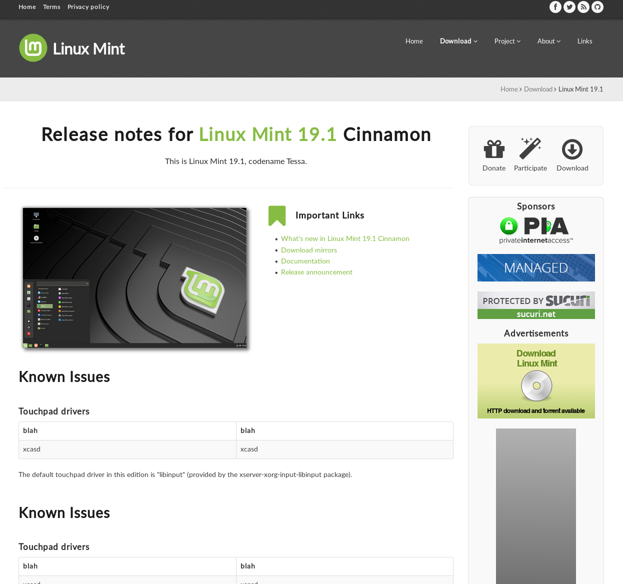
The layout above is used by content pages. The main landing page has a different layout, with no sidebar, less text and more prominent elements to introduce what Linux Mint is and present its main features.
We’re currently focusing our efforts on the header bar and the sponsors section.
The header bar should receive a background or a texture which will make it more minty and give the website more identity. Its navigation menu will also be centered and placed below the title to allow for a larger logo.
In the sponsors section we’re hoping to use monochrome logos which will fit better with the design.
The round Mint logo is a work in progress and it’s something we’re experimenting with, to tackle some of the issues we have with the current logo:
- It doesn’t scale down well. When small (for instance for a favicon, or an application menu logo), its design is too complex to be rendered properly in a limited number of pixels.
- It looks off-center because of its non-symmetrical border, with empty space on the left and none on the right.
We’ve been working around these issues for a while now. In previous releases we shipped with flat, semi-flat and symbolic versions of the current logo (your application menu logo in 19.1 is an example of this) but we can’t address all the issues without removing that border in the shape of a leaf.
One the one hand, it’s hard because we’re attached to it, it’s a strong visual symbol and it’s been part of our identity. On the other hand it opens the door to crisper visuals, better looking panels, menus and splash screens so we’re looking into it.
Performance improvements in Cinnamon
Some of the performance improvements we talked about last month landed in Cinnamon. The window manager received many changes to further decrease input lag and the application menu applet now loads and runs twice as fast as before.
DocInfo and AppSys, two very important internal components were reviewed and simplified.
The cinnamon-menus library was ported to Meson and is currently being reviewed and simplified by Stephen Collins.
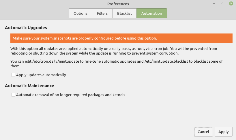
Improvements in the Mint tools
gm10 is leading the charge in improving the Mint tools.
Here’s a preview of what landed in the Update Manager already:
- Automated removal of old kernels and no longer needed packages
- Inhibition of system shutdown/reboot during automated tasks (automated removal and/or automated updates)
- Persistent rotated logs (in /var/log/mintupload.log)
- Auto-refesh is now configurable
- Specific versions can be blacklisted (so you can blacklist a particular update for a package without blacklisting future versions of it)
- Detection of APT locks and retry mechanism (the manager no longer fails when APT is locked)
The cache used by the Software Manager was moved to mint-common, turned into a Python module and given the ability to recognize manually installed software. This is achieved by analyzing the installer logs coming from Ubiquity. As a consequence, in Linux Mint, the Backup Tool and the Software Manager will be able to share the same cache and to list not only the applications which were installed via the Software Manager, but also the applications which were installed via other means.
System Reports
We spent some time working on mintreport, the “System Reports” tool.
The user interface now features an XApp sidebar and a new page was added to show the system information and make it easy for users to copy it into the forums or upload it to a pastebin website.
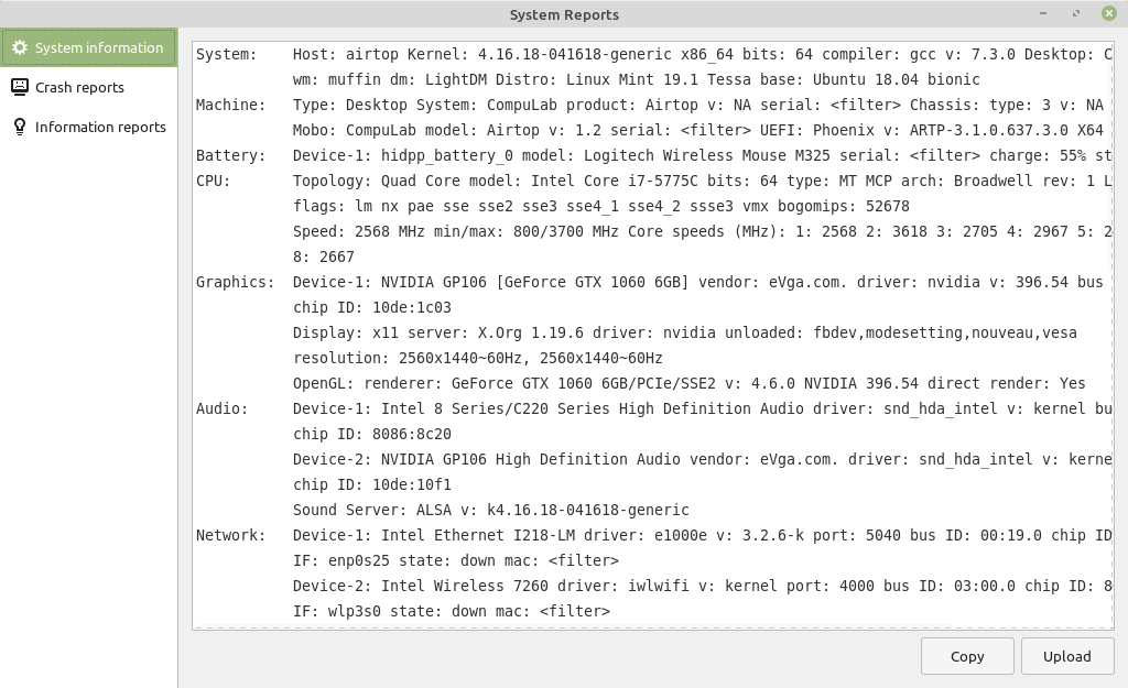
We’re also happy to announce mintreport is coming to LMDE 3. In the past, mintreport relied on Ubuntu’s “apport” to collect and generate crash reports. It now uses systemd-coredump which adds more information to the stack traces and is available in other distributions.
Sponsorships:
Linux Mint is proudly sponsored by:


Donations in January:
A total of $10,568 were raised thanks to the generous contributions of 492 donors:
![]() $500 (3rd donation), James C.
$500 (3rd donation), James C.
![]() $250, William D.
$250, William D.
![]() $109 (2nd donation), Marcus H.
$109 (2nd donation), Marcus H.
![]() $109, Gerhard S.
$109, Gerhard S.
![]() $100 (11th donation), Philip W.
$100 (11th donation), Philip W.
![]() $100 (7th donation), Trevor H.
$100 (7th donation), Trevor H.
![]() $100 (5th donation), Christophe Caillé aka “KKY”
$100 (5th donation), Christophe Caillé aka “KKY”
![]() $100 (4th donation), Mountain Computers, Inc
$100 (4th donation), Mountain Computers, Inc
![]() $100 (3rd donation), Wendy aka “wendygirl”
$100 (3rd donation), Wendy aka “wendygirl”
![]() $100 (2nd donation), Billy Bob
$100 (2nd donation), Billy Bob
![]() $100, James C.
$100, James C.
![]() $100, Steven O.
$100, Steven O.
![]() $100, Jason M.
$100, Jason M.
![]() $100, Marc Harvey
$100, Marc Harvey
![]() $100, Eric aka “WideEyeVideo”
$100, Eric aka “WideEyeVideo”
![]() $100, Hugh K.
$100, Hugh K.
![]() $100, Jim J.
$100, Jim J.
![]() $100, Richard P.
$100, Richard P.
![]() $99, Ahmad A. A. M. S. A. B.
$99, Ahmad A. A. M. S. A. B.
![]() $87, Thomas I.
$87, Thomas I.
![]() $75 (5th donation), John M.
$75 (5th donation), John M.
![]() $65, Sven K.
$65, Sven K.
![]() $54 (6th donation), Derek L.
$54 (6th donation), Derek L.
![]() $54 (3rd donation), Mikko I.
$54 (3rd donation), Mikko I.
![]() $54 (2nd donation), Ivo K.
$54 (2nd donation), Ivo K.
![]() $54 (2nd donation), Bruce J.
$54 (2nd donation), Bruce J.
![]() $54 (2nd donation), Niels K. S.
$54 (2nd donation), Niels K. S.
![]() $54 (2nd donation), Erno I.
$54 (2nd donation), Erno I.
![]() $54 (2nd donation), Jose L. D.
$54 (2nd donation), Jose L. D.
![]() $54, Babatope Aloba
$54, Babatope Aloba
![]() $54, Guy B.
$54, Guy B.
![]() $54, Philipp K.
$54, Philipp K.
![]() $54, Ulf G.
$54, Ulf G.
![]() $54, Theo S. A.
$54, Theo S. A.
![]() $54, Timo S.
$54, Timo S.
![]() $54, Victor F.
$54, Victor F.
![]() $54, Christian B.
$54, Christian B.
![]() $54, Pieter B. D. J.
$54, Pieter B. D. J.
![]() $54, Heiko O.
$54, Heiko O.
![]() $54, Christina B.
$54, Christina B.
![]() $54, Regis C.
$54, Regis C.
![]() $54, Tiziano O.
$54, Tiziano O.
![]() $54, Vassil T.
$54, Vassil T.
![]() $54, Carsten M.
$54, Carsten M.
![]() $54, Jürgen H.
$54, Jürgen H.
![]() $54, Jean-luc W.
$54, Jean-luc W.
![]() $50 (2nd donation), Martin C.
$50 (2nd donation), Martin C.
![]() $50 (2nd donation), Evan M.
$50 (2nd donation), Evan M.
![]() $50 (2nd donation), Enzo P
$50 (2nd donation), Enzo P
![]() $50 (2nd donation), Andras P.
$50 (2nd donation), Andras P.
![]() $50 (2nd donation), L. H. .
$50 (2nd donation), L. H. .
![]() $50, Kurt K.
$50, Kurt K.
![]() $50, Jay Urish aka “W5GM”
$50, Jay Urish aka “W5GM”
![]() $50, Hugh C.
$50, Hugh C.
![]() $50, Brant F.
$50, Brant F.
![]() $50, Russell R.
$50, Russell R.
![]() $50, William N.
$50, William N.
![]() $50, Dale V.
$50, Dale V.
![]() $50, Stanley V.
$50, Stanley V.
![]() $50, Paul C.
$50, Paul C.
![]() $50, Tim W.
$50, Tim W.
![]() $50, David H.
$50, David H.
![]() $50, Leszek S.
$50, Leszek S.
![]() $50, Erik P.
$50, Erik P.
![]() $50, Brian L.
$50, Brian L.
![]() $50, William D.
$50, William D.
![]() $50, Andrea B.
$50, Andrea B.
![]() $49 (2nd donation), Viktor V.
$49 (2nd donation), Viktor V.
![]() $44 (2nd donation), Christian M.
$44 (2nd donation), Christian M.
![]() $44, Michele T. D. F.
$44, Michele T. D. F.
![]() $38 (2nd donation), Svend M.
$38 (2nd donation), Svend M.
![]() $35 (2nd donation), Timothy J. I.
$35 (2nd donation), Timothy J. I.
![]() $35, Sarva Yoga of Media, LLC
$35, Sarva Yoga of Media, LLC
![]() $35, Paul S.
$35, Paul S.
![]() $33 (106th donation), Olli K.
$33 (106th donation), Olli K.
![]() $33 (3rd donation), David Atherton aka “David A”
$33 (3rd donation), David Atherton aka “David A”
![]() $33 (3rd donation), Jürgen H.
$33 (3rd donation), Jürgen H.
![]() $33 (2nd donation), R. Sch.
$33 (2nd donation), R. Sch.
![]() $33 (2nd donation), Francesc M. C.
$33 (2nd donation), Francesc M. C.
![]() $33 (2nd donation), Renaud C.
$33 (2nd donation), Renaud C.
![]() $33, JRS
$33, JRS
![]() $33, Marco F.
$33, Marco F.
![]() $33, Eduard K.
$33, Eduard K.
![]() $30 (2nd donation), Amit L.
$30 (2nd donation), Amit L.
![]() $30 (2nd donation), Riccardo C.
$30 (2nd donation), Riccardo C.
![]() $30 (2nd donation), P. P. .
$30 (2nd donation), P. P. .
![]() $30 (2nd donation), NomP aka “NomP”
$30 (2nd donation), NomP aka “NomP”
![]() $30 (2nd donation), Frank R.
$30 (2nd donation), Frank R.
![]() $30, Patrick M.
$30, Patrick M.
![]() $30, Steven E.
$30, Steven E.
![]() $27 (11th donation), John K. aka “jbrucek”
$27 (11th donation), John K. aka “jbrucek”
![]() $27 (8th donation), Ralf D.
$27 (8th donation), Ralf D.
![]() $27 (4th donation), Heiko P. aka “CyCroN”
$27 (4th donation), Heiko P. aka “CyCroN”
![]() $27 (3rd donation), Laszlo R.
$27 (3rd donation), Laszlo R.
![]() $27 (2nd donation), Yoyo Fernandez aka “Yoyo”
$27 (2nd donation), Yoyo Fernandez aka “Yoyo”
![]() $27, Robin G. aka “thorian93”
$27, Robin G. aka “thorian93”
![]() $27, Alain B.
$27, Alain B.
![]() $27, Frederick D.
$27, Frederick D.
![]() $27, Eugenio B.
$27, Eugenio B.
![]() $27, Sylvie T.
$27, Sylvie T.
![]() $27, Magnus Wiborn aka “m00se_77”
$27, Magnus Wiborn aka “m00se_77”
![]() $27, Heinz-mario F.
$27, Heinz-mario F.
![]() $25 (89th donation), Ronald W.
$25 (89th donation), Ronald W.
![]() $25 (29th donation), Larry J.
$25 (29th donation), Larry J.
![]() $25 (17th donation), Ray
$25 (17th donation), Ray
![]() $25 (8th donation), Charles W.
$25 (8th donation), Charles W.
![]() $25 (8th donation), Eric W. aka “powerwagon75”
$25 (8th donation), Eric W. aka “powerwagon75”
![]() $25 (7th donation), Steve T.
$25 (7th donation), Steve T.
![]() $25 (4th donation), Vincent M.
$25 (4th donation), Vincent M.
![]() $25 (4th donation), Ranald C.
$25 (4th donation), Ranald C.
![]() $25 (3rd donation), James H. aka “DrJim”
$25 (3rd donation), James H. aka “DrJim”
![]() $25 (2nd donation), Michael S.
$25 (2nd donation), Michael S.
![]() $25 (2nd donation), Alex S.
$25 (2nd donation), Alex S.
![]() $25 (2nd donation), Karl B.
$25 (2nd donation), Karl B.
![]() $25 (2nd donation), Philip J.
$25 (2nd donation), Philip J.
![]() $25 (2nd donation), Jean-pierre G.
$25 (2nd donation), Jean-pierre G.
![]() $25 (2nd donation), Jignesh R.
$25 (2nd donation), Jignesh R.
![]() $25 (2nd donation), Derek B.
$25 (2nd donation), Derek B.
![]() $25 (2nd donation), Allen C. W.
$25 (2nd donation), Allen C. W.
![]() $25, Ray H.
$25, Ray H.
![]() $25, Christine R.
$25, Christine R.
![]() $25, Raj P.
$25, Raj P.
![]() $25, Robert H.
$25, Robert H.
![]() $25, Warren P.
$25, Warren P.
![]() $25, Dominick A.
$25, Dominick A.
![]() $25, Mohammad N.
$25, Mohammad N.
![]() $25, David C.
$25, David C.
![]() $25, Lelend F.
$25, Lelend F.
![]() $25, Eddie B.
$25, Eddie B.
![]() $25, Jason L.
$25, Jason L.
![]() $25, Ron Grimes
$25, Ron Grimes
![]() $25, Barry P.
$25, Barry P.
![]() $25, Robert S.
$25, Robert S.
![]() $25, Chris P.
$25, Chris P.
![]() $25, Jonathon W.
$25, Jonathon W.
![]() $25, Richard M.
$25, Richard M.
![]() $25, Joseph H.
$25, Joseph H.
![]() $24, Baden B.
$24, Baden B.
![]() $24, Anja L.
$24, Anja L.
![]() $22 (23rd donation), Derek R.
$22 (23rd donation), Derek R.
![]() $22 (9th donation), David M.
$22 (9th donation), David M.
![]() $22 (8th donation), Janne S.
$22 (8th donation), Janne S.
![]() $22 (5th donation), Gabriel T.
$22 (5th donation), Gabriel T.
![]() $22 (4th donation), Anon
$22 (4th donation), Anon
![]() $22 (4th donation), Peter V.
$22 (4th donation), Peter V.
![]() $22 (3rd donation), Christoph B.
$22 (3rd donation), Christoph B.
![]() $22 (2nd donation), Jens B.
$22 (2nd donation), Jens B.
![]() $22 (2nd donation), Jure V.
$22 (2nd donation), Jure V.
![]() $22 (2nd donation), M.C..
$22 (2nd donation), M.C..
![]() $22 (2nd donation), Wolfgang H.
$22 (2nd donation), Wolfgang H.
![]() $22 (2nd donation), Modesto P. V.
$22 (2nd donation), Modesto P. V.
![]() $22, Philipp S.
$22, Philipp S.
![]() $22, Takuo N.
$22, Takuo N.
![]() $22, David O. V.
$22, David O. V.
![]() $22, Ulrich H.
$22, Ulrich H.
![]() $22, Claudio M. M. V.
$22, Claudio M. M. V.
![]() $22, Mathieu L.
$22, Mathieu L.
![]() $22, Norbert D.
$22, Norbert D.
![]() $22, Enrico G.
$22, Enrico G.
![]() $22, Kari B. H.
$22, Kari B. H.
![]() $22, Heiko S.
$22, Heiko S.
![]() $22, Emanuel B.
$22, Emanuel B.
![]() $22, James B.
$22, James B.
![]() $22, Norbert S.
$22, Norbert S.
![]() $22, Martin D.
$22, Martin D.
![]() $22, Giorgi M.
$22, Giorgi M.
![]() $22, Sylvester B.
$22, Sylvester B.
![]() $22, Bernd H.
$22, Bernd H.
![]() $21 (2nd donation), Gerardo R.
$21 (2nd donation), Gerardo R.
![]() $20 (32nd donation), Jt Spratley – Musician | Writer
$20 (32nd donation), Jt Spratley – Musician | Writer
![]() $20 (28th donation), Larry J.
$20 (28th donation), Larry J.
![]() $20 (14th donation), Kwan L. aka “DigitalHermit”
$20 (14th donation), Kwan L. aka “DigitalHermit”
![]() $20 (14th donation), Lance M.
$20 (14th donation), Lance M.
![]() $20 (6th donation), Bryan F.
$20 (6th donation), Bryan F.
![]() $20 (5th donation), G&A
$20 (5th donation), G&A
![]() $20 (4th donation), Mike W aka “bajan52”
$20 (4th donation), Mike W aka “bajan52”
![]() $20 (3rd donation), Guy L.
$20 (3rd donation), Guy L.
![]() $20 (3rd donation), Pj S.
$20 (3rd donation), Pj S.
![]() $20 (3rd donation), Sebastian W.
$20 (3rd donation), Sebastian W.
![]() $20 (3rd donation), Rick D.
$20 (3rd donation), Rick D.
![]() $20 (2nd donation), Dana S.
$20 (2nd donation), Dana S.
![]() $20 (2nd donation), Roy L.
$20 (2nd donation), Roy L.
![]() $20 (2nd donation), Xword.com
$20 (2nd donation), Xword.com
![]() $20 (2nd donation), Jairo C.
$20 (2nd donation), Jairo C.
![]() $20 (2nd donation), Colin S.
$20 (2nd donation), Colin S.
![]() $20 (2nd donation), Mark B.
$20 (2nd donation), Mark B.
![]() $20, Jason P. M.
$20, Jason P. M.
![]() $20, Dawid G.
$20, Dawid G.
![]() $20, Kristine O.
$20, Kristine O.
![]() $20, Babak
$20, Babak
![]() $20, Henry W.
$20, Henry W.
![]() $20, Ben L.
$20, Ben L.
![]() $20, Guy D.
$20, Guy D.
![]() $20, Alan B.
$20, Alan B.
![]() $20, Leigh B.
$20, Leigh B.
![]() $20, Charles O.
$20, Charles O.
![]() $20, David W.
$20, David W.
![]() $20, Paramjeet P.
$20, Paramjeet P.
![]() $20, Juan G. R. D. L.
$20, Juan G. R. D. L.
![]() $20, John M.
$20, John M.
![]() $20, Juan C.
$20, Juan C.
![]() $20, Jarrod L.
$20, Jarrod L.
![]() $20, Wesley C.
$20, Wesley C.
![]() $20, Andrew S.
$20, Andrew S.
![]() $20, Steve B.
$20, Steve B.
![]() $20, Gary T.
$20, Gary T.
![]() $20, Juan V.
$20, Juan V.
![]() $20, Bryan S.
$20, Bryan S.
![]() $20, Ronald F.
$20, Ronald F.
![]() $20, Henrik Hemrin
$20, Henrik Hemrin
![]() $16 (25th donation), Johann J.
$16 (25th donation), Johann J.
![]() $16 (24th donation), Andreas S.
$16 (24th donation), Andreas S.
![]() $16 (15th donation), Doriano G. M.
$16 (15th donation), Doriano G. M.
![]() $16 (12th donation), Gerard C.
$16 (12th donation), Gerard C.
![]() $16 (4th donation), Alessandro L.
$16 (4th donation), Alessandro L.
![]() $16 (3rd donation), Krister R.
$16 (3rd donation), Krister R.
![]() $16 (2nd donation), Laurent M.
$16 (2nd donation), Laurent M.
![]() $16, Tobias L.
$16, Tobias L.
![]() $16, Marianne B. L.
$16, Marianne B. L.
![]() $16, Vladimir B.
$16, Vladimir B.
![]() $16, Gerald M.
$16, Gerald M.
![]() $16, Michael B.
$16, Michael B.
![]() $15 (19th donation), Stefan M. H.
$15 (19th donation), Stefan M. H.
![]() $15 (11th donation), Michel C.
$15 (11th donation), Michel C.
![]() $15 (2nd donation), Fred B.
$15 (2nd donation), Fred B.
![]() $15, Marcin A.
$15, Marcin A.
![]() $15, Anthony D.
$15, Anthony D.
![]() $15, Johnathan H.
$15, Johnathan H.
![]() $15, Larry U.
$15, Larry U.
![]() $15, Thomas P. H.
$15, Thomas P. H.
![]() $15, Joseph K.
$15, Joseph K.
![]() $15, Gareth L.
$15, Gareth L.
![]() $15, Martin L.
$15, Martin L.
![]() $13 (8th donation), David Kelly aka “Daveinuk”
$13 (8th donation), David Kelly aka “Daveinuk”
![]() $13 (3rd donation), Artur M.
$13 (3rd donation), Artur M.
![]() $13 (2nd donation), Thorsten K.
$13 (2nd donation), Thorsten K.
![]() $12 (94th donation), Tony C. aka “S. LaRocca”
$12 (94th donation), Tony C. aka “S. LaRocca”
![]() $12 (10th donation), Raymond M. (retired)
$12 (10th donation), Raymond M. (retired)
![]() $12 (3rd donation), H&R Project AdataMan aka “AdataMan”
$12 (3rd donation), H&R Project AdataMan aka “AdataMan”
![]() $12 (2nd donation), Brent F.
$12 (2nd donation), Brent F.
![]() $11 (19th donation), Alessandro S.
$11 (19th donation), Alessandro S.
![]() $11 (11th donation), Queenvictoria
$11 (11th donation), Queenvictoria
![]() $11 (7th donation), JCSenar – linuxirun.com
$11 (7th donation), JCSenar – linuxirun.com
![]() $11 (5th donation), Jerome M.
$11 (5th donation), Jerome M.
![]() $11 (5th donation), Barry J.
$11 (5th donation), Barry J.
![]() $11 (5th donation), Slobodan Vrkacevic
$11 (5th donation), Slobodan Vrkacevic
![]() $11 (4th donation), Thomas Z. aka “Nagev for the Slamina”
$11 (4th donation), Thomas Z. aka “Nagev for the Slamina”
![]() $11 (4th donation), Vittorio F.
$11 (4th donation), Vittorio F.
![]() $11 (4th donation), Bernhard M.
$11 (4th donation), Bernhard M.
![]() $11 (3rd donation), Bertrand S. J.
$11 (3rd donation), Bertrand S. J.
![]() $11 (3rd donation), Philip E.
$11 (3rd donation), Philip E.
![]() $11 (3rd donation), Pjerinjo
$11 (3rd donation), Pjerinjo
![]() $11 (3rd donation), Claus Moller
$11 (3rd donation), Claus Moller
![]() $11 (2nd donation), Paolo C.
$11 (2nd donation), Paolo C.
![]() $11 (2nd donation), Evgenii S.
$11 (2nd donation), Evgenii S.
![]() $11 (2nd donation), Joseba S. I.
$11 (2nd donation), Joseba S. I.
![]() $11 (2nd donation), Benoit V.
$11 (2nd donation), Benoit V.
![]() $11 (2nd donation), René C.
$11 (2nd donation), René C.
![]() $11 (2nd donation), Fabio Baratti
$11 (2nd donation), Fabio Baratti
![]() $11 (2nd donation), Cedric B.
$11 (2nd donation), Cedric B.
![]() $11 (2nd donation), Elias B.
$11 (2nd donation), Elias B.
![]() $11, Akshay S.
$11, Akshay S.
![]() $11, Michael H.
$11, Michael H.
![]() $11, Hannes B.
$11, Hannes B.
![]() $11, Rudolf R.
$11, Rudolf R.
![]() $11, Gerwin P. V. D.
$11, Gerwin P. V. D.
![]() $11, Fabrice B.
$11, Fabrice B.
![]() $11, Andreas K.
$11, Andreas K.
![]() $11, Marco N.
$11, Marco N.
![]() $11, Roberto B.
$11, Roberto B.
![]() $11, Jerome C.
$11, Jerome C.
![]() $11, Dimitris Tsigkopoulos
$11, Dimitris Tsigkopoulos
![]() $11, Laurent O.
$11, Laurent O.
![]() $11, Alain F.
$11, Alain F.
![]() $11, Janne M.
$11, Janne M.
![]() $11, Ladislav D.
$11, Ladislav D.
![]() $11, Marco T.
$11, Marco T.
![]() $11, Alessandro B.
$11, Alessandro B.
![]() $11, Alfred H.
$11, Alfred H.
![]() $10 (38th donation), Thomas C.
$10 (38th donation), Thomas C.
![]() $10 (29th donation), Frank K.
$10 (29th donation), Frank K.
![]() $10 (26th donation), Paul O.
$10 (26th donation), Paul O.
![]() $10 (23rd donation), Jim A.
$10 (23rd donation), Jim A.
![]() $10 (16th donation), Dmitry P.
$10 (16th donation), Dmitry P.
![]() $10 (15th donation), Rick R.
$10 (15th donation), Rick R.
![]() $10 (15th donation), Terrance G.
$10 (15th donation), Terrance G.
![]() $10 (12th donation), Chris K.
$10 (12th donation), Chris K.
![]() $10 (11th donation), Antoine T.
$10 (11th donation), Antoine T.
![]() $10 (10th donation), Masaomi Yoshida
$10 (10th donation), Masaomi Yoshida
![]() $10 (5th donation), AJ Gringo
$10 (5th donation), AJ Gringo
![]() $10 (5th donation), Bruce D. aka “travtek”
$10 (5th donation), Bruce D. aka “travtek”
![]() $10 (5th donation), Neil E.
$10 (5th donation), Neil E.
![]() $10 (4th donation), Don S.
$10 (4th donation), Don S.
![]() $10 (4th donation), Mladen M.
$10 (4th donation), Mladen M.
![]() $10 (4th donation), Tyler B.
$10 (4th donation), Tyler B.
![]() $10 (3rd donation), Mark W.
$10 (3rd donation), Mark W.
![]() $10 (3rd donation), Anatolii B.
$10 (3rd donation), Anatolii B.
![]() $10 (2nd donation), Graham G.
$10 (2nd donation), Graham G.
![]() $10 (2nd donation), Sadettin Yumuşak
$10 (2nd donation), Sadettin Yumuşak
![]() $10 (2nd donation), Roswitha O.
$10 (2nd donation), Roswitha O.
![]() $10 (2nd donation), Graham J.
$10 (2nd donation), Graham J.
![]() $10 (2nd donation), Hugo G. aka “hugonz”
$10 (2nd donation), Hugo G. aka “hugonz”
![]() $10 (2nd donation), Rodrigo S. B.
$10 (2nd donation), Rodrigo S. B.
![]() $10 (2nd donation), Jack S.
$10 (2nd donation), Jack S.
![]() $10 (2nd donation), Nedeljko Visnjic
$10 (2nd donation), Nedeljko Visnjic
![]() $10 (2nd donation), Anton D.
$10 (2nd donation), Anton D.
![]() $10, Rodney M.
$10, Rodney M.
![]() $10, Janith S.
$10, Janith S.
![]() $10, Ewa D.
$10, Ewa D.
![]() $10, Richard W.
$10, Richard W.
![]() $10, Gonçalo Souza
$10, Gonçalo Souza
![]() $10, Stanislaw S.
$10, Stanislaw S.
![]() $10, Alejandro R.
$10, Alejandro R.
![]() $10, Paragon Emporium, LLC
$10, Paragon Emporium, LLC
![]() $10, Julien Lafleur aka “Julien”
$10, Julien Lafleur aka “Julien”
![]() $10, Harald W.
$10, Harald W.
![]() $10, John C.
$10, John C.
![]() $10, Heiko S.
$10, Heiko S.
![]() $10, Alexander Z.
$10, Alexander Z.
![]() $10, Alfred A.
$10, Alfred A.
![]() $10, Claudio J. F.
$10, Claudio J. F.
![]() $10, Kenneth W.
$10, Kenneth W.
![]() $10, Norman D.
$10, Norman D.
![]() $10, Daniel C. D. S.
$10, Daniel C. D. S.
![]() $10, Johnny R.
$10, Johnny R.
![]() $10, 鈴木 和夫
$10, 鈴木 和夫
![]() $10, Beau D.
$10, Beau D.
![]() $10, Piotr L.
$10, Piotr L.
![]() $10, A1eagle parts
$10, A1eagle parts
![]() $10, Robert S.
$10, Robert S.
![]() $10, Deniz A.
$10, Deniz A.
![]() $10, Brent C.
$10, Brent C.
![]() $10, Kevin D. M.
$10, Kevin D. M.
![]() $10, Richard H.
$10, Richard H.
![]() $10, Goran M.
$10, Goran M.
![]() $10, Wang Z.
$10, Wang Z.
![]() $8.05, Mint Happy
$8.05, Mint Happy
![]() $8 (2nd donation), Nicholas H.
$8 (2nd donation), Nicholas H.
![]() $8 (2nd donation), Sébastien B. aka “SebastJava”
$8 (2nd donation), Sébastien B. aka “SebastJava”
![]() $8, Milan C.
$8, Milan C.
![]() $7 (4th donation), Lluis Solanelles
$7 (4th donation), Lluis Solanelles
![]() $7 (3rd donation), Nicholas P.
$7 (3rd donation), Nicholas P.
![]() $7 (2nd donation), fulgorit aka “fulgorit”
$7 (2nd donation), fulgorit aka “fulgorit”
![]() $7, Shibaev A.
$7, Shibaev A.
![]() $6.34, Tomás F.
$6.34, Tomás F.
![]() $6 (10th donation), gmq
$6 (10th donation), gmq
![]() $6 (7th donation), Michal W.
$6 (7th donation), Michal W.
![]() $5 (32nd donation), Eugene T.
$5 (32nd donation), Eugene T.
![]() $5 (23rd donation), Bhavinder Jassar
$5 (23rd donation), Bhavinder Jassar
![]() $5 (16th donation), Kjell O. B. aka “kob”
$5 (16th donation), Kjell O. B. aka “kob”
![]() $5 (14th donation), Arvis Lacis aka “arvislacis”
$5 (14th donation), Arvis Lacis aka “arvislacis”
![]() $5 (12th donation), Guillaume G. aka “Tidusrose”
$5 (12th donation), Guillaume G. aka “Tidusrose”
![]() $5 (12th donation), Blazej P. aka “bleyzer”
$5 (12th donation), Blazej P. aka “bleyzer”
![]() $5 (8th donation), Jan Miszura
$5 (8th donation), Jan Miszura
![]() $5 (8th donation), Korneliusz M. aka “audiokor”
$5 (8th donation), Korneliusz M. aka “audiokor”
![]() $5 (8th donation), Jan Miszura
$5 (8th donation), Jan Miszura
![]() $5 (7th donation), Michel B.
$5 (7th donation), Michel B.
![]() $5 (6th donation), Pierre G.
$5 (6th donation), Pierre G.
![]() $5 (4th donation), Clint M.
$5 (4th donation), Clint M.
![]() $5 (4th donation), Jozo M.
$5 (4th donation), Jozo M.
![]() $5 (4th donation), Pawel K.
$5 (4th donation), Pawel K.
![]() $5 (4th donation), Lotte
$5 (4th donation), Lotte
![]() $5 (3rd donation), Franco C. M.
$5 (3rd donation), Franco C. M.
![]() $5 (3rd donation), Christoph C.
$5 (3rd donation), Christoph C.
![]() $5 (3rd donation), Fabio N.
$5 (3rd donation), Fabio N.
![]() $5 (2nd donation), IxL
$5 (2nd donation), IxL
![]() $5 (2nd donation), Greg R.
$5 (2nd donation), Greg R.
![]() $5 (2nd donation), MartyJ
$5 (2nd donation), MartyJ
![]() $5 (2nd donation), Parviz Rzayev
$5 (2nd donation), Parviz Rzayev
![]() $5 (2nd donation), Ruslan A.
$5 (2nd donation), Ruslan A.
![]() $5 (2nd donation), Christian W.
$5 (2nd donation), Christian W.
![]() $5 (2nd donation), Joseph G.
$5 (2nd donation), Joseph G.
![]() $5, Valentino K.
$5, Valentino K.
![]() $5, Troy S.
$5, Troy S.
![]() $5, Amy F.
$5, Amy F.
![]() $5, Bruno A. aka “Noobopensource”
$5, Bruno A. aka “Noobopensource”
![]() $5, Cheslav R.
$5, Cheslav R.
![]() $5, carpet cleaning ofallon
$5, carpet cleaning ofallon
![]() $5, Sławomir P.
$5, Sławomir P.
![]() $5, Cls D.
$5, Cls D.
![]() $5, Ed V. D. M.
$5, Ed V. D. M.
![]() $5, Bruno S. A.
$5, Bruno S. A.
![]() $5, Ignatiev A.
$5, Ignatiev A.
![]() $5, Nick Ilievski
$5, Nick Ilievski
![]() $5, Lars P.
$5, Lars P.
![]() $5, Ayhan C.
$5, Ayhan C.
![]() $5, Louis S.
$5, Louis S.
![]() $5, Юрий К.
$5, Юрий К.
![]() $5, Máté K. S.
$5, Máté K. S.
![]() $5, Martin K.
$5, Martin K.
![]() $5, Alacs L.
$5, Alacs L.
![]() $5, Jatinder C. aka “Jaq125”
$5, Jatinder C. aka “Jaq125”
![]() $5, Sangram S.
$5, Sangram S.
![]() $5, Daniel C.
$5, Daniel C.
![]() $5, Manuel P.
$5, Manuel P.
![]() $5, Erik S.
$5, Erik S.
![]() $5, Charmange B.
$5, Charmange B.
![]() $5, Veselinovic M.
$5, Veselinovic M.
![]() $5, Sage M.
$5, Sage M.
![]() $5, Zbyszek S.
$5, Zbyszek S.
![]() $5, Loïc C.
$5, Loïc C.
![]() $5, Jojo
$5, Jojo
![]() $5, Andrew P.
$5, Andrew P.
![]() $5, HOOD
$5, HOOD
![]() $5, Carl-magnus R. V. C.
$5, Carl-magnus R. V. C.
![]() $5, Ilia Iliev
$5, Ilia Iliev
![]() $5, Lucas M.
$5, Lucas M.
![]() $5, Oleg S.
$5, Oleg S.
![]() $5, Ms R J Wilde
$5, Ms R J Wilde
![]() $5, Oliver S.
$5, Oliver S.
![]() $5, Jonas M.
$5, Jonas M.
![]() $5, Zdeněk K.
$5, Zdeněk K.
![]() $5, Ian G.
$5, Ian G.
![]() $5, Günter S.
$5, Günter S.
![]() $5, Jan S.
$5, Jan S.
![]() $5, Randy A.
$5, Randy A.
![]() $5, Luis G.
$5, Luis G.
![]() $5, Guido B.
$5, Guido B.
![]() $5, Ruslan D.
$5, Ruslan D.
![]() $4.5, Eduardo R.
$4.5, Eduardo R.
![]() $4 (3rd donation), Tomasz W.
$4 (3rd donation), Tomasz W.
![]() $4, Donna K.
$4, Donna K.
![]() $4, Sjaak T.
$4, Sjaak T.
![]() $3.5 (2nd donation), Frederick F. J.
$3.5 (2nd donation), Frederick F. J.
![]() $3.5, Keep Up The Good Work aka “I_Love_Linux”
$3.5, Keep Up The Good Work aka “I_Love_Linux”
![]() $3 (30th donation), Kouji Sugibayashi
$3 (30th donation), Kouji Sugibayashi
![]() $3 (5th donation), Cyril U.
$3 (5th donation), Cyril U.
![]() $3 (4th donation), David H.
$3 (4th donation), David H.
![]() $3 (4th donation), Eigennachwuchs.de
$3 (4th donation), Eigennachwuchs.de
![]() $3 (2nd donation), User Manuals
$3 (2nd donation), User Manuals
![]() $3, Abidan H.
$3, Abidan H.
![]() $3, Tomasz Z.
$3, Tomasz Z.
![]() $3, Viktor H.
$3, Viktor H.
![]() $3, Island Web Solutions, Inc.
$3, Island Web Solutions, Inc.
![]() $3, Kenneth S.
$3, Kenneth S.
![]() $2.5, Kori H.
$2.5, Kori H.
![]() $78.52 from 56 smaller donations
$78.52 from 56 smaller donations
If you want to help Linux Mint with a donation, please visit https://www.linuxmint.com/donors.php
Patrons:
Linux Mint is proudly supported by 217 patrons, for a sum of $1,146 per month.
To become a Linux Mint patron, please visit https://www.patreon.com/linux_mint
Rankings:
- Distrowatch (popularity ranking): 2235
- Alexa (website ranking): 3472
I’ll certainly miss the old logo but the explanation provided for the change is all too familiar to me with projects I have had where scaling has been a real pain. I like the working example shown in the screenshot much more than some of the alternatives that were brought up a few years ago as it still keeps a familiar look.
Your current website is clear and easy to read with a decent information density.
Please don’t interpret ‘modern’ with ‘flashy but difficult to read and with far too much whitespace’.
I think the new design looks much better to be honest.
YES! I like current mint web…
Our website looks old, a lot of people tell us that. I personally still love it and I’m emotionally attached to it, but it’s pretty clear it is outdated. That new design is modern. Now, it may be flashy, difficult to read and have too much whitespace, please do address these points more accurately so we can use your feedback to improve that design.
I like the new round look.
If it is possible to have access to a list of older posts that would be very useful. I know the current site shows the 5 most recent posts, but I often have to google to find earlier ones. I will miss the existing LM logo as it is like an old friend, but I fully understand your reasons for feeling a change is needed. In the Update Manager, automatic removal of no longer needed packages is a very useful step forward. I look forward to seeing the new site, great work!
Hi Nigel,
Good point. I added an archive widget to make it easier to go back in time. Note that there’s also a search field in the sidebar, so you don’t need to use google to find blog results.
Hi Clem
That is great, a big THANK YOU! Much appreciated
I think the new logo will definitely make way for better use in the cases already mentioned. I happen to agree with the notion in that I still love the old/current logo but it certainly can be a bit frustrating to utilize for certain projects.
As for the website, I really feel that keeping the old site layout would be just fine, but I’m also open to anything else as long as it doesn’t break or cause any unnecessary inconsistencies. Really, that’s up the people maintaining it and if they can user-folk to chime in on that once in a while, that’d be great.
Lastly, I’d like to once again say “hooray” for the updates and improvements being made for Cinnamon.
Once more, I’d like to bring it to the attention of the team (+R&D) to please considering porting in or adapting some kind of desktop launcher like Gnome/Unity Dash. It doesn’t HAVE to be exactly like that as other examples include Albert, Synapse, and Mutate.
I think introducing a launcher into Cinnamon would really make the desktop pop out and give the users a particular feature that they would find in most other DEs as well as operating systems in general. A system-wide indexer that keeps track of things, and is then easy to query things for amongst other abilities, is a very useful feature to include in a modern desktop.
The argument can be made that the current app/panel menu already gives a rudimentary approach to finding apps, and while that remains true, other distros that also offer their own panel menus happen to include a launcher of some sort. It’s a very smart utility that introduces an interface that most people are familiar with and can be intuitive enough to find things aside from apps. Being able to use this kind of thing on a desktop has become more essential as time progresses and it’s not only because other major operating systems have it.
I truly feel that the Linux Mint community would benefit from using this kind of innovation and I ask that the R&D folk please take this into consideration—or anyone who will have an affect on this getting in.
Thank you for your hard work and I only hope to see more. 😉
Thanks Bry,
I agree. This is something we want to do in the long term. We refer to it as “desktop search” in our roadmap.
Great, absolutely great the improvements to the Mint Tools! 🙂
But I don’t like the idea of the logo redesign. One basic marketing rule is: Never change your logo if it isn’t absolutley necessary. Ok, it’s not symmetric and hard to scale. So what? I can live with these (imho: minor) weaknesses. The Logo in the screenshot looks too flat to me. There’s no “spirit” in it. Please stay with the leaf ! 🙂
Very heartily agreed!
Thanks Marcus.
The perfect logo is already designed. Don’t know who made it, but have a look at this:
https://ya-webdesign.com/explore/linux-mint-logo-png/?utm_source=gg#gal_745601
I have to agree with Chris. I like the simplicity and the background contrast. It’s clear and tidy looking.
That’s brilliant. Somebody has clearly been working on this. The suggested design that’s just a letter M on a green background shaped like a leaf is absolutely perfect. Even if I had seen it in a different context I think I would have recognised immediately what it was meant to be. Also, it has fewer lines than the present leaf logo – the one with the stylised “LM” and extra lines around the outside. We may know it and love it, but it’s easy to see that a single M would scale better.
That is a nice logo.
Certainly that is a good logo. Make it fully round and it will be great for scaling and etc!… 🙂
Thanks Chris,
The idea of a simplified leaf is interesting and the single M (as opposed to LM) would help with the issues I described. I’ve a little subjective problem with it because it departs even further from the current logo… but it could work. I’ll definitely look into both of these ideas.
There’s something I didn’t really mention in the post which is somewhat important. The logo you see in the screenshot isn’t really an LM in a circle, it’s a circular logo representing an LM. As such it’s very easily deviated into squares, circles, standalone LMs, triangles, anything we need really. When we have a shape around the LM, or the M, we have to add yet another frame or shape around it to adapt it to the shape we want.
Still with all that said, I find the idea of the simplified leaf shape border interesting and I’ll make sure to look into it.
Yes, Yes, Yes. Love this, have already swapped out my Application Menu icon with this one and it is beautiful.
I understand the affection for retaining the original LM in the logo to bridge with the past, but since we are looking for a transition to a cleaner look, I think not much is sacrificed by keeping only the M. My 2¢
I like the first logo leaf shape, but with logo concept revised open desktop lettering, keep LM letters, original colors
A request to linux mint team that please keep the default firefox browser as ubuntu, manjaro does. You can keep yahoo as default home page as they are profitable partner but don’t remove google from search engine list. At present we add Google manually from mint website, please stop this procedure. Keep Google as you keep other search engines in option. A humble request. Linux mint is the best user friendly distro as I experienced and I suggest others too to use it. Best of luck.
We’re clear about who’s sharing the traffic you generate with us (there’s a bit of a war at play here, because between your money and the advertiser selling you a product, there’s us, the browser, the search engine, and quite a few intermediate parties) and who’s respecting your privacy. You can decide not to like or use who we partner with, this is YOUR computer, not OURS, but you can’t blame us for making them the default.
Choosing another engine is extremely easy. Just add it and make it default, you do it with just a few clicks of the mouse and you’re done.
All those design changes are very, very welcome from my point of view. The Linux Mint website looks old and clunky, too much 2005-ish, so the new design is a step in the right direction.
And about the new Mint logo, THANK YOU. I know that the current logo must be loved by many people, but… come on! It’s simply ugly! The new logo is clean, modern and retains the identity of the product it represents perfectly. I love it!
Good to know that the boot and splash screens will be updated, presumably using the new logo. Excellent news. The olds ones were ugly to me, too.
Linux Mint is the best distro in the world. Keep on it like that!
Hi Leon,
Thanks for your feedback. Can you explain what’s ugly about the current logo? Is it the use of gradients? the different tints of green?
We’ve followed the new trends a bit (i.e. the new version if flatter/simpler..etc). I’m interested in your feedback though. We know what’s wrong with the website, we know what we can’t do with the logo, but it’s the first time I hear the logo is ugly and I want to understand it a bit more.
I think the problem is the lack of symmetry and the excess of green color. Not that the green is ugly, but the distro (and the icon) exaggerates in the use of that color. Even so, it’s the best distro currently, just needs some fixes on the design. My opinion only.
I’m interested in this. I like the idea of hinting at the green in a subtle way and I wouldn’t mind making the overall artwork more neutral. It’s not easy though, if you have ideas on how to achieve this, please illustrate and share them with us.
Hi, Clem,
Perhaps “ugly” wasn’t the best word to use. The current logo looks… outdated, like if it where describing an old software. That’s it, plain and simple. It has too many things that make it look… convoluted. The gradients and the different tints of green certainly contribute to it, and also its shape.
Seeing the current logo in the boot screen doesn’t transmit the sense that a modern operating system is installed on the computer. It looks like the Windows XP logo: very known to pretty much every person, but a plain outdated one.
One distro that noticed this was elementary OS. Boot their distro and check out their logo. It’s simple yet modern. Their boot screen is a delight to see.
I think the new logo is the right decision. It’s simply beautiful and modern, and retains the identity of Mint perfectly.
PD: not that you asked me, but I want to give you a tip: forget about other distros, Mint is the absolute leader for the average user, and certainly it will be the distro that will make people switch from Windows to Linux massively (if that day should come). Your only competition for the throne is elementary OS. If in doubt and looking for some inspiration… check what is elementary OS doing. Certainly, they don’t lack anything in the design area. Just a tip.
Keep doing such a great work like you are. Mint is the absolute best. Cheers.
Thanks Leon.
Maybe this:
https://imgur.com/NwYgzRj
the example above is in the bottom panel
Please, not yet another circle logo. EVERYTHING is turning into a f@#$@#$g circle. If you’re not a wheel or a gear or a globe, circle logos suck. Windows and Mac user icon… a CIRCLE. Many email servers address book photos… a CIRCLE. And business logos add to that. Not saying that I’m hellbent on “the old logo must not change”, but please, not a circle.
Add the Facebook, Twitter, RSS icons as yet more circles and my point continues.
You don’t like circles? 🙂
It’s not really a circle per se. If you look at the current logo, it’s made of two distinct elements… the leaf shape and the LM. If you look at this new one, it’s made of one element, the LM, and that’s it. In this screenshot you see it in a circle, but if could be in a square or any other shape, or no shape at all.
I like the new tentative new logo. If I did not, I’d be willing to custom set my own for menu, etc. Who cares what it looks like during start up? After that, maybe try a triangle, hexagon, dodecagon, etc.
new tentative <— new tentative new
I like oldschool LM-website design
Same—there’s really nothing wrong the current design/layout since it was already designed pretty well. The only flaw being, and pretty much the main reason for the change, is that it doesn’t present well on screens that aren’t desktops/laptops.
I would really appreciate a kernel manager in LDME3 as well.
The cherry on the cake would be the ability to manage kernels from debian backports, then giving access easily to recent kernels on a Debian 9 stretch based distro.
Thanks for the good work.
Just a tiny and humble suggestion for the iso verification information on the web page:
For many distros, I like the simple texts written for MD5 and shaxxx sums… Just as a simple list under download links..
That way you just have a look and copy the checksum if needed, that’s all… At least for the latest releases taking place on the https://www.linuxmint.com/download.php page. It would be simpler (and less confusing for newcomers – rather than “first do this, then do that, then type the command cd ISO … – ” )
Just after the current iso Download links:
“MD5 and sha256 checksums for the iso files you’ve downloaded: ”
Cinnamon 19.1 32bit … 64bit …
Mate 19.1 …
And then the link for detailed info, both for earlier releases’ sums and “how to”..
(Meanwhile; terms currently used at the page as “32bit” and “64bit” are better than using x86 etc. for they are less confusing and easy for everyone)
Thanks Emin,
We can add the sums. For instance, in https://www.linuxmint.com/edition.php?id=261, below authenticity, we can add an integrity field with the sha256 sum.
I would’ve thought the solution was staring us all in the face – just lop off the little sticking out bit and make the top left corner into a point like the bottom right corner. Simple, symmetrical, yet retaining the Linux Mint uniqueness. Circles and squares are so passe.
Thanks Lioneldo,
We’ll try that as well.
Best suggestion I’ve yet seen for a new LM logo! Thanks
Yes, if symmetry is need, that great idea. I like the existing Mint logo. I it was very well designed at the time and still looks great. Just a polish to get it symmetrical is all that is needed IMHO. I like the gradients and the green!
Please consider bringing back the KDE version. There are so many features and customization options that I feel are missing from the XFCE, Cinnamon, and Mate versions. I have tried those versions in 19.1 and keep going back to 18.3 KDE Mint.
I have tried Kubuntu, Neon, and Manjaro and they all lack what makes Mint great. Unfortunately for me KDE is that extra polish that makes Mint the best distro bar none.
Thanks
sudo apt update && sudo apt install kubuntu-desktop kde-plasma-desktop kscreen -y
Exactly what Emin said. You can still get KDE on LM. There’s nothing stopping you.
Thanks for the help.
I agree with you. Kate, Dolphin, Okular and a full-working Onboard (Onscreen-Keyboard). I have no alternatives in Cinnamon.
sudo apt update && sudo apt install kubuntu-desktop kde-plasma-desktop kscreen -y
does not work on my laptop. 🙁
Hi ibis, you can use the commands one by one as:
sudo apt update
sudo apt install kubuntu-desktop kde-plasma-desktop kscreen
or visit here: https://linuxhint.com/install_kde_linux_mint_19/
or of course you can use Synaptic (Package Manager) and install Plasma.. Even full..
just don’t forget to click on the Desktop Environment switcher (when installed) in the login window…
Meanwhile – though I haven’t tried- I’d read in Mint Forums that the best is to download Mint XFCE release and install KDE on it.. Then you can even remove XFCE and keep only KDE.. This was suggested for the reason that XFCE is the easiest to remove with almost no traces…
I tried your link several times. It doesn’t work. There’s always a message like “There are damaged packages on your computer.” when kubuntu-desktop should be installed. I’ve no idea, which packages this should be. I’m also not able to repair damaged packages in synaptic. Sometimes I feel like using Windows 10 🙁
I like the new website design and that new logo looks way more modern than the current one that I think was holding Linux Mint back.
Anyway, I have a question for the Mint team if you’re reading this. I just started using Linux Mint and I’m loving it except for the fact that Flatpak apps don’t fit in with the system theme if you use something other than Mint-Y. Is there any plans to add the variants of that theme like Mint-Y-Dark and Mint-Y-Dark-Red to Flathub?
In the meantime you can override the flatpak theme to use Mint-Y-Dark or Mint-Y by doing this in the terminal:
sudo flatpak override –env=GTK_THEME=Mint-Y-Dark
To remove the override do this:
sudo rm /var/lib/flatpak/overrides/global
Hi Joeman,
There is, it’s in our roadmap (“package mint-y variations into flathub”).
Love the new website template proposal, and an update is definitely needed at this point, Mint’s website is starting to look like a time capsule.
As for the logo, I think you should perhaps put together a bunch of options and maybe allow a vote?
Performance improvements into Cinnamon is great news.
The mint tools look fantastic! Automatic updates is great news! For stuff like the kernel, it could be easy for a new user to just assume that when they see updates for the kernel being downloaded that it means it’s being installed.
Will these automatic update tools possibly also grab latest versions of drivers too? Such as nvidia drivers?
A time capsule, it’s outdated indeed, but it’s not a 100 years old yet 🙂
Regarding the logo, as for the website, we don’t need votes, but we do need feedback.
The Update Manager (and thus the automatic updates) takes care of upgrading anything when a new version comes up. In addition to this they also look at new versions of kernels (which aren’t upgrades per se). Drivers have the upgrade strategy they’re given, individually… for instance if you look at nvidia-375, you can see it’s now a transitional package which depends on nvidia-384. As such, its newer version is picked up by the updates (automatic or not) and you do end up with the newer driver.
The new website is fine with me.
However, I want more attention being devoted – as per my previous comments – to making Mint easier to slim down.
This could involve a “minimalist” download option and/or a version of Cinnamon that gives users granular (very trendy term!) control over what non-essential applications and features to install.
Endlessly adding more features and applications will eventually lead to a bloated mess similar to “Windoze”.
Agree.
I completely agree to this recommendation. It’d be nice to get a way to choose what packages come “pre-packaged” or otherwise receive a minimal install option. Would totally be open to that.
The goal of the distribution is to work out of the box for a large number of typical desktop use cases. Software Manager lets you uninstall whatever applications you deem undesirable for your personal use case, that’s all the granularity you need. Making the user choose pre-installation would just add unnecessary complexity in my opinion.
Hi Scott,
I understand what you mean. We’ve no interest in doing a minimalist installation or to define a core set or even less to ask people questions as to what to install and what to choose, and what to configure… we have three editions, they’re as much OOTB and KISS as possible, we want people to install them with as fewer clicks as possible and for them to be one size fits all, so they please a majority of users just the way they are.
Now, with that said, modularity (which is the very trendy term on our side of the curtain), is a valuable concept in itself and one we all respect. If we don’t “need” to depend on something, we probably shouldn’t. Throughout the different releases we’ve removed a huge amount of dependencies. Two examples come to mind… you can now run mintinstall without flatpak, and you’ll soon be able to run mintreport without apport/systemd-coredump.
Will kernels >4.18 be available in the kernel manager with 19.2’s release?
Yes, they already are. 4.18-0-13/14/15… this is the 18.04-hwe series.
@Clem: Sorry, I meant to imply 4.19 and above. I’m on 4.18-0-15 and love how quick and easy that upgrade from 4.15 was. However, I still have some stability issues on this new laptop (freezes 2-3 times a day). I have a feeling a newer kernel will help, but was trying to avoid using Ukuu if I didn’t have to.
Why not spanning the header with the title to the far right and leave the sponsor bar below it? This way it doesn’t look like a site put aside to sponsors, but sponsors are a part of it. More, the title would be more dominant and centered. Navigations on the top right could go smaller below the title or on one of its sides, still smaller.
Hi mdi,
Can you make a quick illustration of how you see it?
Where is the Remote Desktop?
Well, guys I am very sorry to have to say this, but you just remove functionality to make the things you have to do easier apparently. Instead of fixing, maintaining and supporting useful things, you are moving from tabs into side listboxes (nemo), you are moving the mute button from left to right click (music applet), etc…
Yeah, yeah I know… If I don’t like don’t use…
The configuration of the remote desktop app was moved by its developers outside of the app and into gnome-control-center. In other words you’re looking at an app which worked well in all desktop environments in the past (and which we shipped) and which now only works in GNOME (and so which we removed).
I wasn’t happy to see this happen personally, even less so to be accused of having something to do with it. Sure we can patch it, but why continue to ship an app which isn’t developed to work in the DEs we care about?
The mute button… well we added a mute microphone, eventually we started to have a lot in the left menu, so why not move it to the right-click menu? How is this a bad decision?
What’s wrong with sidebars? We’ve been very conservative with design switches but we do have to adapt at some stage to the fact that there are more and more touch devices out there, and we’re not talking about phones here. If you’re using a touchscreen, whether it’s a monitor or a laptop screen, toggles work better than checkboxes and sidebars work better than tabs, this isn’t us pushing this trend, it does make sense, and it’s something which is pushed at toolkit level.
I used to know that sidebar (listboxes), were used over tabs when the number of items could be changed by the user or when there was too many of them to fit in a tab section. For the listboxes to work better, the user has to increase the width of the component, so that he can tap an item with more ease since it occupies more horizontal space. But this is not possible in nemo preferences! So it’s the same thing. Anyway…
@Clem, So we should expect all tabs to become sidebars (listboxes) in linuxmint in the future? Because according to your mentions that would be ideal?
The Remote Desktop… I did not accused anyone of just removing it. I just said that you could place some efforts to replace (~maintain~) it, with something similar?
I hope that everybody understands that I try to make some points here. Because I care…
Hi Vassilis,
Yes absolutely and your feedback is very welcome.
The remote desktop app also fell under scrutiny because it was quite niche and its place in the default selection was arguable. The same thing happened to Pidgin, mintupload and a few others. They’re easily installable but they don’t necessarily have to be there ootb for everybody. Some of the alternatives for remote assistance also are proprietary and your choice of software here might depend on who’s helping you remotely and what software they’re most comfortable with.
…and should we expect that linuxmint to be touch screen friendly???
@Clem Sorry to say this, but the touch friendly argument is highly debatable.
First of all touch only devices are only of a limited use productively and so you should not find yourself playing around in configuration menus that often (unless you have to constantly fight a proprietary OS developers data gathering).
Making usability worse for the main production workflow of a classical Desktop in order to to cater to a light use only touchscreen friendliness does not make sense, especially when one does not go all in.
While switches may not be that big of a deal (although pressing your finger on a checkbox is just as easy as pressing your finger on a switch), the sidebar menus are an abomination from the small screen mobile phones that have no place on a desktop or even a tablet. They are not easier to press than tabs they just happen to fit the main orientation of a mobile phones screen. On a monitor, or even for a lot of tablet use cases, they just steal a lot of screen real estate and make finding the settings you are looking for much more confusing (partly because you need much more eye movement to scan the settings than in a tabbed configuration menu and partly because you suddenly have to scroll the content because it does not fit on a single page anymore in the new design(e.g. look at the Xed configuration options and compare it to older tabbed versions or have a look at the current Windows system settings app to see where this path leads in the end).
It is a bad and lazy design decision to have only one desktop design for touch only and desktop devices alike, especially if is modeled after the special requirements of small vertical oriented devices when you have to make the experience worse for every single one of they use cases to archive that.
Sure, all the big players are doing it and it’s also kind of sadly familiar by now, but that does not change the fact that it frustrates basically every user.
Funny enough GNOME is on a good way to create a really touch friendly DE(big icons, very simple and limited apps with few options) but seem to refuse to market it that way – But no one would call it seriously a good Desktop-PC DE in it’s vanilla form (without extensions) if he has any requirements greater than opening Firefox.
I would really appreciate a kernel manager in LDME3 as well. Thank you for the great work. Cheers
The present web designing is based on broad band in mind, content rich, colorful, flashy with unnecessary animations and images, with the important matter tending to show up last! Please make it simple with the WiFi users in mind. That way the portal is more pleasant, readable and to the point.
Sorry if I missed it: Will automatic kernel removal arrive in 19.1, or are these items scheduled for 19.2? (Slightly related, I’ve found I can consistently fix Hibernation in 19.1 now. Thank you! The more-broken Ubuntu remains at only 50% success when using the buttons. It’s been a pig-wrestle.)
I was hoping for news of APT fixed Mint 18 ISOs. Is there an ETA? Thx.
They’re sheduled for 19.2. The APT update is there for everyone already, but in terms of ISO we’re looking at 19.2. We’re also looking into moving to https for packages.linuxmint.com and adding an option in mintsources to only list https mirrors. I didn’t post about this yet because it’s in the roadmap but it’s not implemented yet.
I don’t know of the origins of the current Mint logo, but it looks to me like a graphically-stylised mint leaf; so maybe you could use a more realistic-looking mint leaf as a basis for a logo.
It would look more three-dimensional, especially with a drop-shadow effect, and the “LM” initials could follow the contours of the surface of the leaf.
Many thanks to you all Linux Mint 19.1 and LMDE 3 are both outstanding.
Is the new Mint icon likely to be applied in an update to the Cinnamon bar?
Also would it be possible to have a Driver Manager for LMDE 3 please and have NVIDIA driver 396 available and a Vulkan update please? I realize this may not be possible due to what is available in the Debian Stretch repositories (NVIDIA driver 396 and latest Vulkan are required by Proton on Steam Play)
A kernel removal tool would also be great for LMDE 3.
Apologies for all the questions
Kindest Regards
Guy
Well, we’re not there yet. If we settle on a new icon, yes, it’s likely to come as an update (and we’d probably preserve the old artwork as well for people who want to keep things the way they currently look).
The Driver Manager currently relies on ubuntu-drivers-common, which is specific to Ubuntu.
@Clem
I put Mint 19.1 Cinnamon on a friend’s hp laptop. He’s trying Linux for the first time.
He has no wifi. Driver Manager shows no proprietary drivers in use, while both ethernet and Mint usb plugged in. The Network interface in the tray shows no wifi toggle switch.
P.S. by Sir Douglas: His laptop is capable of wifi. Windows on another partition has wifi.
Hi,
You should ask for help on the forums or the IRC. When doing so, mention which wifi chipset is on the laptop (this is usually found with “lspci” or “inxi -N”). People will likely ask you for more information when trying to help you and will help you troubleshoot the issue.
I have 3 laptops and one desktop using WiFi With Linux Mint 19.1. Since the new Network Manager updates, I have to reboot the desktop every couple of hours because it loses the WiFi connection to the router. The laptops sometimes work ok, sometimes slow WiFi, and sometimes lose WiFi. I see on the forum that many are having the same issues. I have switched hundreds and hundreds of people from Windoz to Mint. I would hate to think they are all having issues with the Network Manager bug also. Is there a update coming to fix this
Hi Dwayne,
Which update exactly? Does reverting it resolve the issue? Can you link to a bug report for this on Launchpad?
Personally, I think the current website is fine. The new site looks good as well. I strongly agree with those that feel the logo should remain as it is, or just receive minor modifications. Mint has a very nice logo as it is.
I like the new logo – the only thing is that the `lm` seems a bit off-center (too far to the upper left).
Ah maybe because the L is a bit too high/tall.
Wow, new website building. My father always said “Do not repair, what is not broken”. So I believe some things are broken in LM 19.1, why just fix them first? Just my two cents.
I too find the new website design neither necessary nor appealing. Looks like too much wasted space and less information density, which means I have to scroll much more. There has to be a way to please both, desktop und mobile users, without sacrificing one for the other?
I agree—and honestly, I never had an issue with the website. It’s people who apparently visit the website via their phones or tablets who seem to have an issue. While I accept that smartphones have come a long way, I don’t find them fit to replace all experiences found on the desktop. I think the current layout they have now is fine, but working on something like this only seems like a superficial endeavor that can be later used to excuse any “development” clogs. I’d rather they focus on further developing Cinnamon and making more amendments to any problems users have voiced.
“working on something like this only seems like a superficial endeavor that can be later used to excuse any “development” clogs”
You’re kidding right?
That’s not constructive. What would you have us do? Put the website redesign aside for another 10 years, until maybe one day we, Ubuntu, Linux, systemd, Epson, NVIDIA all come up with bug-free software that works together 100% for everybody on any combination of hardware you can possibly imagine? Let’s be serious, that’s what we’ve been doing so far… postponing this problem, and that’s why we’re still running that old website.
It’s not the most urgent problem to solve, it never was, and that’s why it never really got addressed. It’s definitely about time though.
@Clem
Obviously, it’s a problem. I just don’t see it as a priority. You agree that it isn’t an urgent need. My concern, while a bit exaggerated, is that this will take resources where they can otherwise be utilized for something else. In the end, and as I’ve stated, it’s up to you guys. I’m all for whatever it is you guys decide to do, as it’s out of my control, but it’d be nice to have a process to things.
P.S. – Did you really respond to me in two replies? Did you make one and then later decide to come back to me? Why?
Hi Bry,
No, the other answer was for rtep.
We’ve a huge amounts of things planned for the next release and there also are various individuals within the team with various different goals. To give you an idea, nobody else but me in the development team is working on the website redesign right now. You can see it in this post even, there’s been plenty of action on the mint tools and on cinnamon performance improvements. I’d also like to stress that I personally am involved in various projects. The website is not taking all my time, neither is communication (people who tried to engage with me by email probably know this), or merging PRs. I worked on mintreport lately, and I’m now working on contrast improvements https://github.com/linuxmint/mint-themes/milestone/1.
@Clem
I hear ‘ya—and again, the team’s work (including yours) deserves every praise. The improvements I’ve seen over time have been phenomenal, especially with Cinnamon. I hate to be “that guy” but I can’t help but worry about some things if there’s no schedule laid out. Obviously, given the nature of how this is run (community effort), I shouldn’t expect such a thing. However, when multiple goals are listed and for which do no coincide with one another, I start to question where the focus is and where it will be down the line. I’m sorry to hear that you’re taking the brunt of the new website load. I would volunteer to aid in your efforts but it isn’t my forte. Hopefully more folks can get interested in helping out (who can).
Hi Clem, it’s not clear what is ment by “Automated removal of old kernels” – remove ALL old kernels or remove all old kernels BUT the latest TWO or leave ONE or TWO of every MAINLINE? And WHEN are they removed – on UPDATE, once a DAY or…?
Thanks for clarifying.
Exactly what I was thinking. I’d hate to think they’d remove all old kernels as that could leave many systems unable to boot given underlying circumstances.
+1
Always leave last know working Kernel as fallback.
It leaves the last 2-4 kernels in place and runs once a week. It also will never remove the release kernel that comes pre-installed nor any kernel that you manually installed via the kernel window, so you can preserve a specific version if you want to. In other words, I don’t think you have anything to worry about.
@gm10 That sounds great, thanks.
Wonderful news from this great team!…
Agree with the new website and logo designs. We are nearly in 2020!… 🙂
Make the great work coming!… Many thanks!… 🙂
*bug report: Timeshift
default location for snapshots is the first partition in the primary drive.
this is especially Bad for multi boot computers.
IF that first partition is for a different OS it does not notice or notify the user of the error.
Hi Peter,
Please submit this as an issue at https://github.com/teejee2008/timeshift/issues.
Clem:
Thanks for the response. I did file a bug report with teejee2008.
I saw that you had forked Timeshift and was not sure that any patches would get to the Mint repos.
https://github.com/linuxmint?utf8=%E2%9C%93&q=&type=fork&language=
Thanks, Peter
Hi Peter,
Yes and no, it’s a “git fork” technically, but we’re not “forking” Timeshift per se. We patch it a bit but it’s always in between two releases. We enjoy using git much more than quilt, I’d rather work with branches and commits than with patches and series personally, so github is used not only for our own projects, but also to “patch” upstream projects.
I’m sorry to see Mint go further down flat icon road. I get, sorta, the scalability issue. Fortunately, Mint is customizable so I can swap in some skeuomorphic icons to entertain myself. Thanks as always for a great product.
Hi Dan,
I understand where you’re coming from, and you’re not the only one who doesn’t like it, but this is a trend and it’s quite universal. Ignoring it just makes us look old. Look around us, it’s happening everywhere. What looked good 10 years ago now looks outdated.
Nothing wrong with the current website design – maybe you guys have gotten tired of it:-)
As far as “The round Mint logo is a work in progress…”. When I took a look at the (new) embedded design, making the logo extremely small: it looks like a closed fist with a pinky sticking up. The full-sized logo doesn’t generate that visual but the really small one does.
Gee, thank you, now I cannot unsee this…ever. 😛 :brofist:
I absolutely love the Mint team’s focus on providing a high quality, modern, fast, easy UX that’s suitable for new Linux users, it’s what really makes Mint stand out from the crowd as a great OS to recommend. Mint has become the ‘go to’ recommendation to suggest people who are new to Linux and want to try something that won’t leaving them bewildered. Keep at it guys and I’ll keep up the donations too, you’re doing a great job!
The new logo appears to be better than the old one but still not good yet. It does not shine the way i wanted it to…In my opinion automatic removal tool can not remove all the old kernel from the system. We need, at least, 2 kernels kept. I for one make a collection of my kernels. I do not want them going away. I have space on my hard drive or partition. The automatic removal tool for no longer required packages it’s welcome. I run Ubuntu Cleaner (PPA) on my Mint’s installations. The Kernels, i never tick them to be removed. As for the site, i think it needs to be redesigned. Cheers!
This is optional and it does keep the 2 kernels you mention.
I think that if you essentially just clip the “stem” off of the logo, that will fix the asymmetry issue while retaining the essence of the leaf shape. In my mind the leaf is too essential a part of the Mint identity to be abandoned. Add me to the list of those who find circles overused and lacking distinctiveness. Besides, the LM fits better into the squarish leaf shape than it does into a circle; the round logo now has empty space inside it, rather than to one side.
I like the web site as is, but the screenshot for the new one looks very nice. As I recall the segfault site had a nice look.
As someone else mentioned, the mint logo is like an old friend. But I agree it does look tired and visually complicated. The old logo does not convey the elegance of the product. The new round one on the screenshot is much better, I think. It might look better if the ascender on the L on the left side didn’t go so high. It wouldn’t look so much like an L then, but that’s OK. And / or use a rectangle with rounded corners, rather than a circle.
Thanks for your continual imrprovement of your products.
Thanks, we can try with the L not going as high. The emphasis is on the LM itself so we can then create variations for any shape (which we couldn’t with the border leaf.. because it was an integral part of the design). Here, if we replace the circle with a rectangle, we still have the same logo, we can even remove the cicle, or invert it.
Thanks for the reply, Clem. I’m sure whatever you come up with will be quite nice. And thanks for asking for input.
Please consider changing the green text to something a little darker. Some of us simply can’t read it.
More blinding white light and super thin fonts. Lazy.
Timmy, we can change the font. This one in the screenshot (if I’m not mistaken) is the Ubuntu font, which is widely popular, regarded as one of the easiest to read, and which we’re considering using in the distribution itself. The colors are white for the background and #222 for the text, this is quite standard as well. Please give us more feedback about this, we’re not being lazy, quite the opposite, we want to get GOOD feedback, so that we can address it.
Thanks Joe, you mean a different tint of green or something else (do you have a color code in mind)? or just not using color in titles?
My wife and I really like the new website and logo design.
Of course the most important thing is a stable and intuitive operating system, but the “packaging” is important too.
I think the new design fits much better to the look of LM 19.
Life is change. Some people cannot or don’t want to realize that.
LM is your “baby”. If you guys think it is time for “new clothes” – go for it. 😉
Greetings from Germany 🙂
That’s a nice web design. I think leaf logo design is better than round design. It’s unique and easy to remember.
I want to ask about font settings in Cinnamon. I changed my desktop fonts with Source Sans Pro as default layout font on desktop. Some apps show that changes correctly such as Firefox and Nemo. Some apps has partial font layout changes such as Timeshift, Software Sources, and Update Manager. Could you fix that settings? So the Font settings can change all desktop appearances on any apps correctly. Also I think features for changing font on panel bar and menu can be added on Font settings too.
Thanks a lot. Have a good job 🙂
I don’t mind changes to the website and logo, but please, please do not use a light grey text, that seems to be a current trend on websites.
Hi,
It is, we looked at many other websites for the color palette, most of them use #222 on top of #fff. We can try other combinations, and other fonts weight/family, let us know.
I really appreciate all the improvements, like this one: Automated removal of old kernels and no longer needed packages
Makes the maintenance even simpler. Good work!
I would like to get back the ancient screensavers by default.
Many thanks for the good job
Paul
Your current web site looks a helluva better than the sample you show in the blog. And it’s a helluva lot better looking the Microsoft’s. If it ain’t broken, don’t “fix” it.
Personally I love the new look so far.
NO!!!!!!
DONT CHANGE THE LOGO TO A BORING FLAT CIRCLE!!!!!!!!!
Seriously why does every OS/ interface/ UI now have to have flat boring and uninteresting designs?
The leaf is iconic, to make the logo a boring circle will make mint just another face in the crowd, no identity, no personality.
Want to be bland and boring just slap a plain white circle with the words “Linux mint” on it.
Want to stand out?
Please for the love of whatever god you may or may not believe in and dont change the logo to some boring circle with no personality or flrair.
The leaf its iconic leave it be!
Agree.
I prefer the new logo.
Couldn’t agree more!
I agree 100%. What ever you do, please do not change the logo. It is the face of Linux Mint. You don’t change your own face either.
My favourite suggested Mint logo is still the one made by Troken, as shown in this forum posting and the one below.
https://forums.linuxmint.com/viewtopic.php?t=280401#p1545024
Really I don’t get this obsession of wanting all icons and themes needing to be flat boring uninteresting blending into one another in favor of what is called modernism. Honestly it’s not modern it’s just boring you’re just standing in the crowd not standing out, might as well be just another faceless distribution with no personality or no flare to it. The leaf icon is good don’t get rid of it in favor of a stupid flat boring Circle. The logo needs to stand out it’s iconic to this distribution
What about this one?
https://forums.linuxmint.com/download/file.php?id=46322&mode=view
(I wish there was only letter m centered, because in all kinds of designs I’ve seen the letter L spoils everything.. but imho, that’s better than the current and the new.. And also the green is bright again, not pale.. and the leaf shape is kept and symmetric at top left and right bottom.. PLEASE consider this one)
Yes, that’s the one from Sebastien. We’re looking at it as well. It has interesting elements, the green tint, the shape of the border and that idea of the split in the middle (which I’m not found about, but which is interesting nonetheless).
I see a (pitch)fork in the negative space. Ha ha. 🙂
The Mint Team should really do a better job on the status icons and respect the size when resizing. For example the update notification icon is bigger the transmission icon is smaller, etc…
Please look into it will the desktop look much better, please take in consideration.
Please create an issue for this in github.com/linuxmint/cinnamon/issues. Paste the output from Cinnamon (alt+f2, type LG, enter, then choose the logs tab) so we can see the resizing of the systray icons, and add a screenshot. Cinnamon is trying its best to resize icons properly, it’s not always easy, depending on the app.
no doubt this is one of the best distributions of linux and of course that’s why I’m in it but something is worrying me always have the blog actualization but this time to past more than 1 month without updating may be preparing some news team the team linux mint or maybe the opposite a fatal that worries me or really disturbs me
I do not know if it is well expressed by the translation of the translator’s language
Wow Freddy 🙂
Let’s stay positive, people can go under a bus without actually dying. We refer to this as the bus factor and it’s something which affects many projects. It would certainly affect Mint, it’s hard to know how, depending on what happens and to who, but whatever it is, people would know pretty fast is something was affecting the project. I don’t think it would take a month, and at the same time we really shouldn’t start worrying about death in between two monthly blog posts. Please? 🙂
If it makes you feel better you can see the dev’s activity on https://github.com/linuxmint/ and you can talk to moderators on IRC. No news is good news though, we all die eventually, no matter how often we post on our blog.
The problem is not the site. With all due respect, I do not like this old logo. The new logo seems pretty better.
Soy nuevo el Linux Mint 19.1 y me gusta, a pesar de que no he podido trasladar de mi USB 3.0, a mi PC DELL Inspiron 17, 5,000 series, toda la Información allí guardada y que me interesa. Primero no me aparece o no encuentro nada al instalar mi USB, lo desmonto nuevamente y lo reinstalo y nada, no hace nada Linux Mint.
Habra alguna manera que no sea Formatear la unidad o subirla mi información a la nube?
Ya probe actualizar todo, y sigue sin aparecer o no puedo ver ningun puerto USB.
Gracias por la ayudita.
Try the forums for support. This is the blog.
https://forums.linuxmint.com/viewforum.php?f=68
Hola Felipe,
Esta guia puede ayudarle: https://linuxmint-installation-guide.readthedocs.io/es/latest/
Puede preguntar y encontrar ayuda aqui tambien: https://forums.linuxmint.com
I’m really pleased to read about the new web design and think it’s the right decision. Looking forward to seeing it go live and I’m sure it will evolve as time progresses.
The logo is a tricky one but was wondering if the ‘L’ could be retained and be integrated further into the design. I did a quick mock-up just to get a feel for possibilities. It’s rough, but just to give the gist : https://ibb.co/BCHn1xp
Hi Mick,
I think if we’re going towards this we may as well drop the L. Other people have mentioned a similar idea, with a symmetrical leaf border and a single M in the middle.
Mick, that’s a very nice-looking logo.
La interfaz que ya existe se ve bien, actualizarla o no me parece trivial… ya que es alago que va a suceder pronto de todas maneras, saludos
Hey everyone, I made up a mockup design for a Linux Mint logo, something ‘halfway’ between the circle and the old leaf design, what do you think? https://www.dropbox.com/s/tezaw12ery2jcv4/Linux-Mint-Design.jpg?dl=0
Grady, “Congratulations !” with a single word.
All so beautiful. I hope Mint Team takes these into consideration. (Both “your version” and the alternative are so nice, can’t decide 🙂 ) The colours are also nice: bright …
P.S. Although the top-left is the most beautiful part, maybe you make a second Alternative for both with simple symmetric corners top-left and bottom-right (this way small icons won’t look too small due to spacing.. And maybe a third Alternative for both 1st and 2nd designs with just plain m centered..
Hi Grady,
Thanks for doing this. They’re nice alright and I agree with Emin, I think it’s worth trying to make the shape symmetrical.
Yes!! Grady, your versions are far better at preserving Mint’s brand recognition than the new round ones do. I was especially intrigued by the way the white/gray/black backgrounds affected the overall appearance. I found that it was all too easy for the new round logos to trick my eye into seeing a partially framed green “w” instead of a white “Lm.” This was most noticeable with the black background. In contrast, your updated leaf designs offered more resistance to this optical illusion, even when I was trying to see it. I think that’s important because, as I said before, it helps preserve the Linux Mint brand recognition. Well done!
I actually really like this take on it. The circle version looses something, the leaf is just too integral to the feel of the logo. Grady’s design feels like it would fit well with the new icons of LM19.
Hi Clem:
Thanks very much for addressing my suggestion for a minimalist version or for choice in installing package features. I promise to stop pestering you on this issue. Best Regards.
Why not use the new site layout with the old leaf design at the top as well as on the welcome screen when firing up, but use the circle where it is needed for scaling purposes?
Because it looks different enough to look like a different icon. It’s hard to explain this and I’m not even sure I’m right when saying this… but here goes.
In our current logo, the border is an integral part of the logo. We can simplify the gradient, the tones of green, even link the L and the M together and we still have the same logo (more or less), but if we remove the border, we get something that looks significantly different and we then have a consistency issue.
In the new logo, we only really have an L and a M, and that itself is the heart of the logo. The green shape around it, whether it’s green, grey, transparent, round, square, triangular, bordered or not, that’s not as important. By adopting something simple we can add complexity around/behind it. By having something a little too complex, we’re constrained in how we can use it.
To some extent, Grady’s logo could be just a usage of that new logo, same logo, different background.
I have been re-purposing old XP and Vista computers with Mint to be used by various charities, community groups, and individuals not able to afford new computers. I’ve mostly been installing 18.1 xfce on these with an occasional 18.3 Cinnamon, due to the low resources (typically 1 or 2 GB RAM, Core 2 Duo processor, etc.) and have started installing 19.1 xfce or Cinnamon. One issue I’ve had is getting the new 19.1 to recognize and install WiFi on these old systems. Driver manager only lists one option for driver install, if any at all (18.1 for example, gives 3 options to work thru until one works, not always the first one.) and I have yet to get that option to control WiFi with 19.1, one case I reverted back to 18.1 xfce, another case I wanted to keep 19.1 cinnamon, so I just plugged in a USB adapter, which worked plug-and-play. Is there something you can do to improve the compatibility with these old machines, and is there another way to load old wifi drivers into 19.1?
Are you talking about broadcom wireless chipsets? You can see what drivers the backend recommends, if you open a terminal and type the following command: “ubuntu-drivers devices”.
I am very new to Linux Mint and of a conservative mind set. I really like the current logo and offer the old saying :
” If it aint broke don’t try to fix it “. Is it possible to go ahead with a new logo design and also offer the option of staying with the old one, thereby satisfying most users on both sides.
Well not on the website.. but yes, in the distribution, absolutely. We’re very careful with this kind of thing when introducing changes like this. If we change your splash screen and the Mint logo all over the place, we’ll continue to ship with the older one for a couple of years so you can switch it back and make things look the way they were.
Great news! I hope this will also affect the update of icons in LM Cinnamon.
There is no problem with the folders icons, but all other icons should be refreshed.
Thank u!
Glad the sites getting an update. Mint is my favourite gnu/Linux and really well developed and polished, the website needs to reflect that. One question. Are there any areas of Mint that need contributions or help from a JS developer?
Hi Zac,
Yes, a large part of Cinnamon itself is in JS: https://github.com/linuxmint/cinnamon.
I’m really pleased to read that that website is getting a much needed overhaul. I recommend LM to everyone but almost feel embarrassed when directing them at the current website. It’s become very tired looking and really doesn’t reflect the excellent work that’s going into LM. I see no reason why it has remain like an archived page from early 2000’s. One note on the proposed design screenshot; the sponsor column seems a little too prominent. Perhaps as sponsors they should be, but I think it distracts from the actual content that visitors want to see.
Hello LinuxMint I ask a very big favor in the auto update could put a way to configure the easiest with an intuitive tool that is simple example two bars one that says that so often cools the auto update and the other every few Available updates proceed to self-update Example 2 Thank you
🧐👍
People are not going to come to the Linux Mint site and decide not to install and use Linux Mint because of the look of the site. Folk use Linux Mint because it is friendly and powerful, its reputation precedes it. The look of the website is of little importance.
It saddens me when Clem says that people have been telling Mint that the site needs revamping. That’s like telling someone you don’t agree with their choice of clothes or hairstyle and, moreover, that they should change their style to match the modern trends.
I say take a stand. If Clem likes the current site, as I do, stick with it! Mint is a distro for computers, not for phones. Why should everything nowadays bend to cater for phones and their requirement for dumbed-down websites and design?
Hi Pete,
The people who say that are people who use it. People who don’t, we don’t hear from. We’ve all done it though, when something is new we go “shopping” and look at what’s on offer. Whether you’re looking for a new car, a new phone, a new free app even, if there’s 30 of them out there, you’re not going to review them all, you’ll go by reputation sure, but you’ll also go a bit deeper and take time to test the few options that looked good to you initially, at first sight, based on criteria that might have very little to do with the product itself or the reasons why you might enjoy it in the long run.
I also agree with the feedback. I do like the website but I also agree with the fact that it follows a trend that is no longer current. It’s not just a question of style, or a question of compatibility with mobile devices, it looks dated because it follows codes which were and are no longer trendy.
I can still enjoy the same music I did in the 90s, and wear the same clothes as I did back then, and I can enjoy that and some people would as well, but all of that still has 90s written all over it, it’s not just a question of taste, there’s an element of nostalgia maybe, and definitely an element of time involved here. Websites no longer look this, some people enjoy our websites, others don’t, and that’s subjective, but recognizing the fact that it’s dated, we can agree on this objectively.
@clem IMHO you don’t need advice from the people who uses mint for the logo, but from professional artists / graphic designers. Someone with good taste and experience in design who doesn’t uses mint will give you a better design advice than a long time mint user with bad taste…
I think what’s wrong with the logo is the M that becomes a L. You can turn it anyway you want, it will never look good (IMO).
Can the kernel of LMDE 3 be upgraded to 4.14 or higher?
You can get 4.19 from stretch-backports.
I am a newbie. I don’t know why.
Many Debian-based system distributions have a kernel of 4.14 or higher,
while the LMDE3 kernel is 4.9. This problem is a new computer.
The old computer (2012) motherboard is MSI H61M-P20
installed LM18 LM19 LMDE2 LMDE3 is very smooth.
The new computer (2019) motherboard is MSI B360M MORTAR TITANIUM
Only LM19 can be installed smoothly.
LM18 LMDE2 LMDE3 failed to connect due to installation (X appears in the connection graphic),
so the installation failed.I think the LM18 LMDE2 LMDE3 has a kernel below 4.14.
I most hope that LMDE is better than LM in terms of kernel and performance,
and I don’t have to rely on Ubuntu in the future.
Alternatively; You can try to install Liquorix kernel. https://liquorix.net
The main reason is that the connection cannot be made during installation,
so the instruction cannot be executed.
If the LMDE 3 release is Kernel is 4.14, or if the license is online,
Therefore, only Linux Mint 19 can be used at this time,
and LMDE 3 cannot be enjoyed quickly.
Clem, I admit I like the idea of a fresh new air on the website, but at the same time I agree with those users who are tired of round logos everywhere. The proposed leaves are very pretty, indeed.
BTW, are there some sort of “specs” about the current LM logo ?
I mean, color, gradient, size… Or, at least, an “official” vector version of it ?
If you’re a Mint user, then for example at: /usr/share/mint-artwork/logos/scalable.svg
Yes, and as part of the new website we’ll include a logo guidelines page for this.
Hello, i have a question regarding the Mintbox mini pro 2.
This might not be the apropriate place to ask that but anyway…
So here it is… If i install windows 10 on it, will i be able to run autoCAD, by autodesk???
I really want to buy one or two, but i also need autocad…
Please respond asap…
Otherwise, i love Mint and i think the new website redesign is way better than what there is actually…
You’ll be able to run any Windows software within Windows. If you’re asking if AutoCAD and/or Windows 10 are resource hungry, I have to admit I really don’t know. From what I hear, yes, Windows usually uses more resources than Linux, as for AutoCAD I suppose it depends what you do with it. I can’t really help I’m afraid, hopefully someone here uses it and will answer better than me. What you can do is, knowing how Windows/AutoCAD run on your current hardware, compare the benchmarks for the mintbox mini pro 2 to the score you’re currently getting.
AutoCAD consumes all resourses with 16GB of ram and a i7 processor.
It might actually *run* on a mini box but I am sure it will be a real dog.
You need more horsepower.
Have fun with designing your fresh spring dress 😉
Concerning the web design: why not base it on your blog page? dark green background, black sidebar (for sponsors and stuff) and a white paperlike look for the content?
Logo does not really need a redesign in my opinion.
poderiam usar o gnome
Hi,
Why don’t you try October web framework for designing your website? It is great and very flexible and powerful.
Give it a try
https://octobercms.com/
sorry I forget to put the link on the main comment
I’m agree with logo changes. I was looking all user proposals on this post, and I stay with two options:
1) This, from gm10: https://forums.linuxmint.com/viewtopic.php?t=280401#p1545037
2) And this, from Grady (both variants): https://www.dropbox.com/s/tezaw12ery2jcv4/Linux-Mint-Design.jpg?dl=0
And I’ll be much more pleased if you decide to change the original boot animation to the one that Xubuntu uses: https://ubunlog.com/wp-content/uploads/2018/01/6A3.jpg
I really prefer an animated spinning circle than a serie of blinking dots
Hi Matias,
We spent time in January on boot splashes and menus, they’re put aside for now in case we changed the logo but we did have a look around and noticed the Xubuntu plymouth animation alright. Grady and SebastJava joined the design team recently and we’re working and discussion ideas for the logo.
Thanks for the software it is so appreciate
After the hard drive gave out I could not install Windows to a SD card
So I switched to linix mint
Here is my proposal for a new logo. I created this in October and December 2018:
https://forums.linuxmint.com/viewtopic.php?f=19&t=280401
The proposed logo is not radically different. It’s just a new version.
But re-created. Totally redrawn. Made flat, simple, and symmetrical.
Later in this topic, I made these additions:
https://forums.linuxmint.com/viewtopic.php?p=1565764#p1565764
https://forums.linuxmint.com/viewtopic.php?p=1571506#p1571506
Hi Sebastien, yours is my favorite ( https://blog.linuxmint.com/?p=3732#comment-148264) and I wish it becomes the new logo. Both 3 have nice colours also.
(if possible) can you please make a copy and just:
1- Make the m simple (without the tail) in current design, and
2- Remove the white border (all green bg) (2 derivatives: As it is currently and with plain m)
This way you and we can see how it would look & compare.
Yours also will fit most places for it’s a square with overall dimensions and it really looks like a cute leaf.
Congratulations and thanks in advance.
P.S. Imho; the only way to get rid of L is to make a simple m centered with the word LINUX under it -small & aligned with m on both sides – although it won’t be visible in small icons.. Maybe you try such an alternative, too …
Thank you for the update. I appreciate it.
As the past month I insist in the necessity of a fingerprint integrated with Mint, I believe it is a great improvement.
Many thanks
Congratulations, Material Design is so 2014. *rolleyes* The new mockup looks boring, lotsa glaring white space. Looks dated already. Thank you google for that material design spreading everywhere making webistes less useable. And don’t get me started about all the badly implemented “responsive design” overloading the website in reality with data in the background.
Same for the circle shaped logo. Looks like a bazillion other logos saying nothing. The current is distinct. When a manager has nothing substantially to add, he changes letter heads and company logos. And babbles something about “fresh wind” or something. I get the problems with scaling, but turning it into a circle is the solution everybody else seems to use. Nothing special, a dime a dozen out there.
Thank you for the excellent work.
As to Cinnamon, I would dearly love to options to remove the search- and scroll bars from the menu applet and to change its width. A long time ago this was implemented in a third party menu applet, called Configurable Menu (or something similar).
I just realized that a feature seems to be missing from the Update Manager change list. Will the 19.2 system tell the user when a reboot is needed to complete the update?
The lack of this notification is a security issue now that Sleep is often more used than Shutdown.
Yeeeeeemwell.. it’s not that easy. But for most packages which require a reboot (kernel updates for instance), yes, it should land in 19.2.
This is just close to the idea: Either not to apart too away from the current logo and to modernize it with 2 simple touches:
Remove the white frame outside and fill all with plain green.
I wish the top left was the same with the bottom-right (without protrusion, as it causes a gap on the left and makes small icons look smaller), then it would be almost perfect to simply modernize the current logo without too much change..
https://nyingspot.b-cdn.net/wp-content/uploads/2017/05/linuxmint-logo.jpg
Do you agree?
Hi Clem and Mint devs;
I note a problem with the pre-installed version of GIMP 2.8 on 19.1 Tessa Cinnamon 64 bit edition, installed on a 250BG hard drive, which I’m trialling as a replacement for 17.3:
When opening an image file (several tried .jpg and .bmp — verified fine with 17.3) using File –> Open, the entire OS freezes up but the screen remains visible and only the cursor can move about but nothing responds to unfreeze it, not even CTRL-ALT-DEL. I have repeated this several times. I can use File –> Open as Layers as normal and opening files using right-click –> open with –> GIMP works fine too.
I tried to repeat this bug from the live DVD; GIMP worked normally when opening an image using the File –> Open method. It only freezes the OS when installed on the hard drive.
My system: Intel Core-I5 4468 4-core 3.20 Ghz CPU
Intel Xeon E3-1200 4th/5th generation internal graphics
Ram: 8 GB
Hard drives: 500 Gb and 1x 250 Gb
I hope this is an appropriate venue; it might be a GIMP issue rather than a Mint one. I’m just an average Mint user, still gaining experience and not an expert in submitting bug reports. It’s also not a criticism on your fine operating system. Thank you for Linux Mint and your work on it. ( 17.3 for the win!)
Cheers,
kevs.
Is this only happening in Cinnamon? (you can replace Cinnamon with metacity with “metacity –replace” in a terminal, to see if it freezes metacity as well).
Hi again Clem;
Thanks you your reply; sorry for my late reply. I carried out your instruction (metacity –replace) and found the freeze does not occur in Metacity, but does occur in Cinnamon. The OS freezes when the ‘open’ button on the file manager window is pressed. Also, does not occur when using ‘file –> open recent’. GIMP version is 2.8.22 pre-installed.
I have to say I’m not keen on flat icon themes either. I’m sorry for double-posting; you can remove my earlier post down below.⇩ 🙂
Cheers,
kevs.
Clem, the create launcher here is still not working in Mint 19.1 cinnamon, why? It works in xfce.
Until it’s fixed in the source, you could apply the fix now by downloading the patch file: cinnamon-desktop-editor-c42a03a.py.patch from: https://forums.linuxmint.com/download/file.php?id=46641
Then open a terminal in the download folder and run:
sudo patch /usr/share/cinnamon/cinnamon-desktop-editor/cinnamon-desktop-editor.py < cinnamon-desktop-editor-c42a03a.py.patch
Sorry about the delay, there are two issues including this one we’ve got fixes for, we’ll send updates for them this week.
I like the new design and logo, keep up the good work 🙂
Fwiw, I like the current logo much better. The favicon would look absolutely fine (at least on my screen) if it had a transparent background instead of solid white/grey…
Hello Linux Mint in the new version that you can put in the kernel manager if one installs the latest version example 4.18 is replaced by the other that comes after example 4.18 is replaced and the 4.18.01 thanks in advance (。◕‿◕。)
I’d like to see GPU usage inserted into the System Monitor like in W10.
Clem, the logo/icon does not have to contain the letters L and M. A simple stylized leaf on a contrasting background will give it a more modern look. Adding the name Linux Mint (in the same color) next to the logo on your new web design will identify it just fine. That combination would be the extended complete logo.
Get a real commercial artist to help with this. Micro spacing and “weight” of colors and spacing are all critical to good design. Look to Google or Twitter for examples of keeping it very simple. You have sensed that something needs to change. Go with that correct feeling, and leave the hard part to an expert. Great programming (and LM is just that) and the ability to create excellent design does not often reside in the same person.
Couldn’t agree more
A good example here would be this big company you’ve already heard about. Their logo is just a silhouette of an apple. They did not need to write “A” or “Apple” on this logo. And financially, they still manage quite well…
I think the website doesn’t matter, but the logo does, as it is something a user of mint sees everyday. I almost wrote you one day and ended up not doing it.
I used to take the time to change it from the menu bar and the booting and shutting down screen (i see it everyday) as i don’t like it, but i got tired of this gymnastic and live with it now.
I never go on the website unless i need to download a new ISO, so i couldn’t care less about what it looks like, as long as the path to go to the download page is clear and short (and it is, today).
TLDR : the aesthetics of the distro itself are more important than the website aesthetics.
Best, and thanks for your huge work, i love mint.
Thanks Jonathan, it works.
Great. Glad to hear it.
I only have one little question: will LM 19.2 base on Ubuntu 18.04? Our will it use a newer Ubuntu-version?
To the new logo: I like the version in the Webseite Screenshot. But this is also nice: http://i.imgur.com/YzjoiYM.jpg
At the end it, for me the logo is not essential. I can live with every new icon. Although changing to a modern layout is a good choice.
Thank you for your great work. I also like t that you are near the community 👍
Mint is always based on LTS (Long Term Support) versions of Ubuntu (which are once in 2 years.. 16.04, 18.04 ..)
So I can say it will be based again on 18.04.. And I guess the ones later (say Mint 20.0 or so) will be on Ubuntu 20.04 LTS (that’s to say after April 2020)
the best operating system i’ve ever use…
Terminal “Colors” settings are still not working in LM19.1. It was not even working in LM19.
Hi rtep,
They’re working here in gnome-terminal. Are you talking about mate-terminal or xfce4-terminal? What’s not working exactly?
Clem, I’m talking about MATE desktop. Any fix now? Thanx in advance for any fix. There is more…but I believe after mentioned here by me and several others, nothing was fixed currently.
Hi rtep,
You should report it to https://github.com/mate-desktop/mate-panel/issues. Put as much information as possible when doing the report, explaining how to reproduce it and exactly what isn’t working as you expect.
The update for Firefox-65.0.2 is missing one week after release!
Hi dd,
It’s a point release which only contains a windows-only fix. You won’t see an update for it in Mint (or in Ubuntu). https://www.mozilla.org/en-US/firefox/65.0.2/releasenotes/
Lost in the Visuals.
After borking my long-term, 32-bit, 17.x install by trying to install something via PPA, I installed several new versions of Manjaro and Ubuntu to see whether they offered anything beyond what I’d been (mostly happily) experiencing with Mint (since version 13). My interest in Manjaro was the rapidly updated — yet tested — repos. Many packages for Mint/Ubuntu are reasonably outdated. Instead of Mint-Mate I decided to try Manjaro-Mate — but it wouldn’t install on my production hardware, just my test box! Ooops! Back to Mint-Mate 19.1 and Flatpack, which has been working well. But…
A problem I see with all/most distros nowadays is a war against contrast. Manjaro and Mint have it, as do the new and the old web sites. Everything is trending toward gray text…upon gray backgrounds…upon slightly-different-gray…backgrounds…in an unending battle that only 12-year-olds with a can of Jolt cola in each hand can actually win.
Themes are tending toward “dark” which, because of eyesight issues, I don’t prefer. Yes, we have “high-contrast” themes, but these tend to be massively contrasty and most useful for low-vision/legally blind users. Users who just wanna read the text are really disadvantaged.
What ever happened to black text? I struggled to find visual and thematic settings in 19.1 that “mostly” allow me to see text without resorting to “100% contrast for the blind” themes.
As websites and UIs trend toward the “flat, no-contrast look,” usability suffers at the hand of design.
Why?
Regards,
–Kirk in MN
Agree! These :things” need to be fixed before web site and “new”LM logo!
I agree 100%. Ditto for this being a priority over the website and logo.
We’ll all agree that #000 on top of #fff has more contrast than #333 on top of #fff, there’s no discussion, it’s maths. Is it easier to read? Probably, is it easier on the eyes, that’s arguable. What’s pretty clear is that when 19 came out, we had a contrast issue. It wasn’t about debating the current norm (which is to use #222 or even #333 like Elementary, Ubuntu and most other distros on top of #fff), it was agreeing with the fact that we overlooked that problem or didn’t address it enough. And when 19.1 came out, the majority of issues had been addressed, but not all of them.
We’re working on this again and we’ve a series of improvements coming up which will greatly improve contrast in 19.2.
You can follow this work at https://github.com/linuxmint/mint-themes/milestone/1.
Is there merit in considering a name and/or logo change to ‘Mint'(M) only, rather than Linux Mint? You’ve proven this name is it time to own it? As much as the current (old) website provides all we need, the update is pleasant, clean and functional. KISS!
I agree with Kirk. What did happen to black text? The text is too pale even in synaptic packager and hard to see, even in update manager and the green progress bar in barely visible.
We’re still working on this, but here’s how synaptic currently looks https://i.imgur.com/Fpp4ke0.png.
Oops, should read the green progress bar is barely visible in update manager.
Hi,
Could you add securely wipe feature to Nemo’s trash.
https://github.com/linuxmint/nemo/issues/2072
Hi,
Could You add remove/downgrade support with cli for foreign package.
Good idea, that would be nice alright. Thanks for the feedback.
We already have CLI support for removing foreign packages:
aptitude purge ~o
You can do most anything via CLI, it’s the GUIs that require the extra effort. 🙂
gm10, but you can’t downgrade them via aptitude afaik.
I love Linux Mint 19.1! I would love to see a health plan for screens blue light in the future.
Hi Roberto,
We ship with Redlight by default. What do you mean by a health plan?
I agree with Roberto F
I would like to have an option in System Settings (Control Centre) to set Colour Temperature manually.
The standard blue light setting is 6500K.
I would like to have an option to manually set the colour temperature to for example 5500K, 4500K or 3500K for nights, and back to 6500K for days.
Yes Clem there is Timeshift (I am using Timeshift and I think it is a step in the right direction), but Timeshift requires that that your PC is connected to the internet and is dependent of connecting to a server to set an appropriate colour temperature, but this is not ideal if you’re connected to a VPN server in a different time zone.
Android has something similar which they call Night Light (which is a warmer colour than the standard blue colour) where you can set the time for the night light to turn on and off according to your device clock setting.
I would like Linux Mint to implement something similar, only I would like the option to manually set a specific colour temperature, like for example 5500K (or less) for those long nights in front of the computer.
Thanks
Thanks Paul,
I understand now. The Redshift UI is handy but minimalist, you’d want a more complete solution. You can configure Redshift in many ways by editing its settings manually in ~/.config/redshift.conf. There are some details about this at http://jonls.dk/redshift/.
Not only for Linux Mint Main, but for LMDE as well.
In my post I meant of course Redshift, not Timeshift.
But I think everybode understood that.
Side note:
Speaking of Timeshift. I am not a fan of this app and I bypassed it when I upgraded from LMDE 2 to LMDE 3.
Rather I prefer to use the function in Disks called Create Disk Image and Restore Disk Image.
This does not support Incremental backups, but I still prefer it to Timeshift.
For anyone who does not know how to use Disks for this, you would simply run your distro (LMDE 3 in my case) from a USB Disk (the read only Iso Image) and then navigate to the disk you want to create disk image for, usually you would navigate to your Linux Mint System Disk or Partition. You then save it to an internal or external disk.
Later you would use Restore Disk Image to write the whole image back to your Linux Mint System Disk, should you need to do this. For example to fix something if something went wrong in your system during an update or if you did some adventurous editing of the file system.
Creating or restoring a disk image takes about 40 minutes for a 256 SSD on USB 3.0.
Okay i made a edit to the one sebastjava made on the forums:
https://forums.linuxmint.com/viewtopic.php?f=19&t=280401&start=40#p1606132
I go over my reasons for my edit of his icon in the topic but i will repeat them here:
Care if i share an edit I made to this icon?
This is my effort to preserve mints distinctive icon while making it “modern”
My version eliminates the boarder, joins the letters like the old logo and uses the old logos colours so that it reflects the distros heritage.
If Clem went with this I think we would all be happy as the logo retains its uniqueness without being a boring circle or square, or recoloured a boring color like black or blue.
Ralph, congratulations and thanks.. Very close to the one in my mind.. In addition, it’ll fit most places flawlessly since it’s a square in fact -with outside dimensions and 90 degree corners- , furthermore it reminds a leaf better than the current one…
Very beautiful logo Ralph!
I would love it if this became Linux Mint’s new logo.
I like the leaf pattern of the logo. Maybe you can keep it as the identifier of Linux Mint, rather than the LM mark ?
Funny thing, I’ve been looking at the Linux Mint logo for a few years now and I never realised it was meant to be a leaf. It was just a weird shape to me. I feel a bit silly, but I wonder how many other people had no idea it was meant to be a leaf?
Hi Darren, literally same here.. That’s why I’m so excited and interested with the new logo idea.. For at least it may look like a leaf next years 🙂 ..
In addition to yours, I never thought the top-left part was a stem after I learned it was a leaf.. And at first sight the inside shape never reminded the letters L and M to me.. I also agree with the idea that it doesn’t have to include the name or letters necessarily; i.e. Mercedes star, Debian logo ..
Another remark regarding the logo: If you’re planning to stay with the “leaf” version of the logo, consider rotating it by 90°, so that the leaf points into the upper right corner.
People in our culture read from left to right, therefore the current logo is experienced as a falling line. Usually, you try to get a logo that symbolizes progress and growth: a rising line. You see this in Logos by Nike, Apple, Amazon, SAP, Pepsi, hp, ups and many more.
Agree 100 % .
Also it will sit on the bottom-left corner of the screen perfectly (where most people prefer the panel to be) and will look so nice . I just didn’t mention this as it would be considered by the Team a radical change, but the best is that imho..
It seems my last post was considered as spam or so (it was waiting for moderation) i guess due to 7 links at once.. Or is there a problem with using the picture sharing site ibb.co ?
Hi Emin,
We had it twice in moderation here, I approved one copy and deleted the other.
This is just to see how it would look like , “home made” , manually aligned, roughly:
https://ibb.co/bWxp8kV (All together – 6 images)
https://ibb.co/QksyWLn
https://ibb.co/87zghWD
https://ibb.co/yVxDPhC
https://ibb.co/LJS43vV
https://ibb.co/GH2ZfJW
https://ibb.co/K7Gq2tB
L is cropped upside and aligned with m except for the first image.. Although I know that Clem doesn’t like L and M to be split.. Just to give an idea “how it would be”…
Thank you Clem, in fact I sent the second one today for I thought there was a problem …
How about this logo? I’ve read many of the issues and complaints posted here and did my best to address them. Let me know if you would like the original svg file for further editing. Thanks
https://i.imgur.com/gpNK9GB.png
Speaking only for myself, I like this approach in principle but the proportions don’t work. Have you tried scaling this down to 16 or 24 pixels? Doesn’t look good. The border around the text is too thin. Also I keep thinking it might look better if the lower right curvature either was the same as the other rounded corners or none at all.
Thanks,
I really think that, once/if we adopt an LM logo with no “white” border, the shape behind the logo becomes optional and flexible. In other words, we get the ability to remove and change that shape, and even change the colors as we see fit, based on usage, without looking like we changed the identity of the logo itself. With this in mind, I find your shape interesting (it’s square and leafy a bit), but it’s mostly the idea of the LM which interests me. The cut top of the L is interesting too. I think the link between the L and the M should be simplified, it was a nice touch at the time, but we don’t need to keep it.
Clem and gm10 thank you, It seems like the L and M shapes are tough to use without some sort of shape surrounding them. I’ve made a newer logo version with gm10’s suggestion and he was indeed correct. I adjusted the image accordingly. I’ve played around with the LM share by it self and it seems tough to have to be advisable without any kind of shape behind it. I’ve decided not to upload the changes because it end up looking like what Clem had showered off on the new website example. 😀
Ha, looks like we’re all on the Logo trail. I was musing on it whilst watching the rugby and was thinking how can you keep the ‘L’ and not keep it at the same time! Also liked the thought from Jan above about a 90° aspect shift. Anyway another mock-up to chuck into the melting pot.. 🙂
https://imgur.com/a/kNJdIFA
Hi,
I would like to donate/sponsor to linux mint because I feel so indebted….but, do not want to use paypal….seems that is my only venue….
Hi Carolyn,
We’re also on Patreon at https://www.patreon.com/linux_mint.
Just a small suggestion ….. I think it would be better to discuss about the criticalities of the operating system, offering ideas to improve it, instead of spending time dealing with the logo.
I agree 100%. There are some “things” to be fixed in LM19.1 and even in LM18.3. That’s should be priority #1.
Gian, I see your point but I have no programming skills and no ideas of how to improve “the criticalities of the operating system”. But I feel happy that I have been informed and been able to make a comment about the logo. When it changes it won’t be an unwelcome surprise, I’ll be able to say “oh yeah, I knew that was happening and I even made a comment about it”. Its not much but it brought a tiny ray of happiness into my life and made me feel part of the team for a second. Please don’t take that away from me. 😉
I think rebranding is just as important to attract and keep engaged a user base, but updating the logo not too necessary. Website update to better convey info = yes.
Logo is the emblem of a ‘producer’ and, in my opinion, it should never be changed. In doing so, you deny a story and a journey that, so far, has been rich in intelligent planning, challenging work and success.
YES! Good definition.
Hi,
I think it is ridiculous complaining about a facelift of the logo and the webpage. Tell me any big company of any branch (software, hardware, cars…) that did not change their logos, etc.? Who won’t go with time, will go by time… The mint team wants a successful distro which the realize by lots of more right&relevant vs. less wrong decisions for over ten years now! I am sure, I will like the future changes (same as every time). So keep it up!
Are you going to publish a reminder/warning related with end of the Linux Mint 17.x support period?
Yes, we’ll cover this here on this blog.
@ Clem: Those who started faithfully upgrade their Mint somewhere between Daryna and Petra are exempt from the Blog latest news. They left with “Cinnamon 3.8 May 2018” news forever, as Firefox home page was not updated for those versions 🙂
http://www.linuxmint.com/start/daryna/ … http://www.linuxmint.com/start/petra/
I would first like to thank everyone on the Mint development team for the great work! Finally Linux has a distro that is comfortable and user friendly for first time non-techy windows users who need a familiar GUI point and click plug and play OS to replace Win 7 and ESPECIALLY Win 10. Well done!
Since making the change over from Win 7 about a year ago to 18.3 Cinnamon, I have adopted a personal campaign to bring as many MS users I can over to Mint because of my deep affinity for the MS arrogance, greed, and perpetual goof ups. I am devoting hundreds of hours helping non-techy folks get changed over. Working with five at a time currently as I share this.
But there is something I have run into because of the very basic nontechnical users still using Windows. A large percentage of them have trouble with trusting themselves to make the change without first having some idea how Mint is going to function for them. There is a fear and intimidation preventing them from actually trying to run it from boot and get a feel for it. Most don’t even trust themselves or have the drive to risk going into the bios and set the boot order to boot into Linux and try it. The “unknown” is holding them back because Linux has been so “techy” for so long. So I have an idea I would like to share with your team for consideration…
If those who are curious had a place online to first get a feel for it and how it functions first they would have more personal drive and security to pull the trigger and go through the next steps to get it installed. Just a simple “sample” site like webscript developers have for sharing features on how their admin areas work. I think once they have a chance to test it online risk free they will realize that it is just as easy as win 7 to use they will decide that it may be their best option going forward rather than being stuck with Win 10 or being forced into Win 10 when the Win 7 option is no more. I think it might remove the intimidation and apprehension and give them the confidence to do it.
If my web development skills were better I would have already done this and had it up on my server. A web link to a “webtop” Mint Cinnamon OS emulator site could be a HUGE advantage in promoting Mint. Just a minimal emulator with working menus and mouse functions so that they could feel first hand how the point and click interface feels and how simple it truly is to use. Have all the software that comes bundled with it listed in the menus as they should be, but just link these from the webtop menu to the corresponding project sites so that they can read more about each one and what it does.
I really would like to see something like this if it is feasible because it sure would make my efforts to promote Mint a LOT easier. Being able to try it online and get a feel for what it does without needing to risk actually booting or installing it yet would greatly heighten their interest and drive to make the change. Please consider this possibility and if I can help in any way let me know. I would be absolutely willing to host the webtop on my server if bandwidth or disk space is an issue for you here. I also have some pretty good input as to how it might function best and attract windows users, my development skills are just not advanced enough to do something like this yet myself.
Thank you for your time, consideration, and thank you for Mint!
Again… Well done!
J.R.
Thanks J.R.
I’ve seen it done before. I remember Gael Duval doing this for instance with Ulteo. It’s nice but I’m not sure how much efforts it would take and if it does take a lot, I don’t think it’s something we would do in the short term. Simpler instructions on the website and maybe a page dedicated to “trying” Mint, explaining how to download it and run it in say Virtualbox could also go a long way.
Before Mint 19.2 is released, could we have the quick launch icons load from left to right instead of right to left in xfce’s bottom panel?
Hi Stan,
I’m sorry I don’t understand what you mean?
Hi Linux Mint Team
In the February blog at February 11, 2019 at 12:25 I had a post about one of my laptops going into a complete freeze when clicking “Power off the disk” in Disks (gnome disk utility) for USB Sticks or SDHC memory cards in a USB 3.0 memory card reader (flash based USB 3.0 disks).
I am happy to report that his problem does not happen any more! 🙂
I did know how to solve this problem. Internet searches did not bring me to any solution. So I posted the problem here in the Linux Mint blog.
I believe the fix must have been pushed in an update through Update Manager.
Thanks to whoever at Linux Mint or Debian who pushed the fix through Update Manager.
I am using LMDE 3.
I meant in the January blog at February 11, 2019 at 12:25
Thank you
I meant to write “I did NOT know how to solve this problem”.
Paul, you may want to try the Forums next time you have a problem. It’s a very decent place to get help. https://forums.linuxmint.com
(Please, excuse my english.)
Definitely the LM looks cleaner and modern now. I think the leaf should stay, but redesigned to be more symmetric. I also like the idea of tuning down the overall green accents in the distro. It makes it look, I dunno, less serious, and this is… a serious distro.
Great work, and keep it coming. Thank you Mint team.
Just some (more) thoughts about the new logo. 😀
When i first saw your round logo design was thinking: “Hm, ok. Why not? Better than the old one.”
But after all those ideas from the community my opinion is, that the leave shape should stay.
It has a good recognition value.
Of all these suggestions for a new logo this one is my favorite:
https://ya-webdesign.com/download.html
I think a “L” is not necessary. Everyone who wants to use this operating system knows that it is linux-based.
A leaf shape and a “m”. Simple and clear.
The only thing i would change is to mirror the leaf shape so that the result is a rising line, as Jan mentioned in one of the previous comments. (e. g. Nike , Amazon logo)
For me it is so much fun. I am some kind of creative guy. 🙂 In the last days i created some logos based on the one mentioned in the link above and had a wonderful time doing this.
I am looking forward to the final logo and website design.
Hi Markus, the link you gave looks empty (no image), maybe you renew the link or directly copy & paste one from above comments..
I guess you mean this, right? https://ibb.co/K7Gq2tB
And alternatives all at once: https://ibb.co/bWxp8kV
Hello Emin,
Just the “m” a bit bigger, but yes that’s it. 😀
The logo i mentioned is on this site:
https://ya-webdesign.com/explore/mint-logo-png/
The one named: “concept revised www opendesktop”
(2nd line – rightmost)
Yes, I was also thinking to make it bigger, less green gaps (considering small icons) but was waiting to see if people would like the idea of a simple m.. This is done rougly :
https://ibb.co/2M8Brg0
Yes Emin, i see we understand each other. 😀
That kind of logo would be my favorite.
Clem, when I select an icon to put it in the bottom panel it places itself next to the time and speaker applet in Mint xfce. In Mint Mate and Cinnamon the icons position themselves next to the files folder. I don’t like the clock being pushed back toward the center, I would like to see it stay in the right hand corner where it is supposed to be. Everything else is working grate. Xfce works better on my 15 year old computer.
Hi Stan,
… but that’s due to xfce desktop itself, not specific to Mint.. I mean, I have another distro with xfce and the same situation is there: The new icon appears on the rightmost, then you move it to the left ..Xfce ..
I hear that Gnome 3.32 has fractional scaling. Will Linux Mint get this if its supported on X11?
Just another logo
https://imgur.com/BCgXIHK
Is it possible to develop Linux Mint rolling release by combining Debian Testing and Ubuntu Non-LTS distros?
Poster dd above mentioned Firefox-65.and I note that my January 2019 installation of Tara 19.1 indicates Firefox 61.0.1 The Synaptic Package Manager shows none to upgrade though I continue to receive notices that my Firefox is out of date. Shouldn’t I be receiving updates to Firefox ?
Thanks very much in advance !
Duke
Baloo is freezing up my 19.1 Cinnamon system.
Please disregard.
Hi Emin,
Thank you, I did not know I could move the icon from right to left side. I right clicked and saw move.
Stan
You’re welcome 🙂 .. But I agree it’s something frustrating 🙂 (having to rearrange icons everytime)..
And as you might already know: you can do it also right clicking the panel (properties).. All at once, move them up/down, add/remove spaces between them etc..
edit: panel=> preferences => items tab …
Hello! I was download linux mint 19 and my wifi is not work. Can you help me please?
So I know a lot of Cinammon is JS… any pointers on where to get started picking up stuff to work on or fix? There’s a TON of issues in the issue tracker so any advice on where to start?
Feh! The round logo looks like a closed fist with its pinkie fully extended. Some kid’s mother will think it’s a “gang sign” and complain to THEM. Leave the logo alone.
NB: The RSS feed might be on the fritz, ‘cuz I didn’t receive this article.
Your right it does look like a closed fist with its pinkie extended.
Awesome — secret Linux Mint hand-code!
Yes, leave the logo alone. I can’t understand why people are pushing for those flat ugly new logos and “modern” icons. World around us is not flat. That theory is gone for centuries. Just my two cents.
just donated love this distro keep up good work. cant wait for cuddlefish
Hello there!
I’ve been using Linux Mint since 11 – Katya since I’ve tested 8 – Helena which I’ve found in a magazine and decided to download the current version at that time.
In general:
I really like the idea of a new modern look, I agree with you. It is needed, is the trend. But far more important is the flexibility of usage of the logo and responsive capabilities for the site. The link is going to be shared on phones it needs to adapt to any screen. I’m not saying that people are going to download the ISO there. But for sure, new “linuxers” will read about the distro and will be opening the site in tablets and phones. It’s almost a fact.
About the logo:
I think it needs to be revamped as well, even if we get nostalgic. But for the OS there is always the ability to change it back for old timers. Isn’t it? So what’s the problem? You could even launch an Anniversary Edition with the old(current) one.
My two favorites logos as far:
in here
https://ya-webdesign.com/explore/linux-mint-logo-png/
1) https://ya-webdesign.com/images600_/mint-icon-png-5.png
2) https://ya-webdesign.com/images600_/mint-logo-png-6.png
Maybe something in between.
I even would like to contribute to the site if I could.
PS. You want an example of a clean, modern look site?
Well, I do like a lot the color palette of this blog. I’m not saying let’s copy & paste this, but it can be improved to achieve a great flat site. With these colors. It’s just my own humble opinion.
Again for the logo, please stay with the leaf, and make it symmetric. 🙂
Agree with the above. Keep the old logo just streamline it a bit, color tones thickness etc. Otherwise new website is a good step
Any update on new mint version.. Still have no issues with 19.1, but curious to see any new changes. Waiting for website launch.
Good Morning Mint team:
I’m a novice Linux user having downloaded Mate Tara 19 in January 2019. As indicated in Synaptic pkg mgr the Firefox browser downloaded / installed is 61.0.1 while the latest is Firefox 65. Synaptic shows zero updates to install. I receive periodic msgs from various webpages that my Firefox should be updated.
Am I missing Firefox upgrades ?
Thanks in advance for your help !
A small consultation The new edition of Mint will be released in April or May thanks
The overall design looks pretty “modern”. I have been bothered with the old look of the website for a while especially when telling new people to checkout this awesome linux distro.
The Sponsors tab on the right still looks “old”. The colors and the images put in it just don’t go along with the new design theme.
How does the site not look modern as is? It’s one of the few well-designed “legacy” sites I’ve ever come across and the only issue is that it doesn’t render well on devices that aren’t desktops or laptops. Aside form that, the links are clearly visible in the navbar, the site doesn’t incorporate that much in its content and everything is pretty much well focused on the page. It’s simple, easy to navigate, and nothing is holding it back aside from now “popular” viewing screens.
Pity about the demise of LinuxMint at the hands of Microsoft.
Goodbye all !
Please explain? Microsoft has nothing to do with Linux Mint Directly.
It’s flamebait. DNFTT :0
Hi again Clem;
Thanks you your reply; sorry for my late reply. Regarding my earlier post, I carried out your instruction (metacity –replace) and found the freeze does not occur in Metacity, but does occur in Cinnamon. The OS freezes when the ‘open’ button on the file manager window is pressed. Also, does not occur when using ‘file –> open recent’. GIMP version is 2.8.22 pre-installed.
Just a concept logo I made… If nothing else, I hope I can be a muse for someone.
https://imgur.com/a/KBCOuiM
All sides of the LM logo issue have been thoroughly covered above, so I shall abstain from commenting here, save to say that to my mind, the most important characteristic of a logo (aside from not waking loathing in the viewer) is that it be distinctive and easily recognised (and thus to some degree, consistent over time)….
Let me here rather repeat my plea of a few months earlier for an added feature, that in addition to allowing users to configure the size of the mouse pointer on the screen and highlighting it by pressing Ctrl, provides the option to make its colour contrast with that of the immediate background. A very useful feature to those whose eyesight is not quite what it used to be….
Many thanks to the developers for providing us with so wonderfully intuitive a system – and not least, to all users who choose to devote a portion of their valuable time to helping others on the Linux Mint fora. Kudos !
Henri
Hi Clem,
Sorry for commenting too much about the logo. But, would you consider this an alternative to the “fist” ?
https://ibb.co/y4DhKVy
The main proposal is 01.png : all symmetric , with equal distances… (alternatives are only variants of L cut differently)
__________________________________________
Details:
– Again; rougly and amateurly made,
– Main idea is to keep the L in the logo , but an L parallel to the left border,
– Positions and sizes of letters can be changed, -m looks a bit big- in fact, a bit thinner letters look more elegant,
– Green tint can be easily changed to darker if it looks too bright. (On the other hand, the most beautiful side of the current logo is the vivid green which should be kept imho. Although darker bg. provides better contrast with white shapes on it.)
L is bigger and surrounding m ; as Mint is in the Linux “familia”…
Consequently ; in accordance with the famous KISS:
A square ,
A circle ,
2 letters ,
Flat green .
Best Regards 🙂
And the alternative leaf “looking upwards” as suggested in above comments – as a rising sign-
Again, L is parallel to the circle :
https://ibb.co/QKFYfJ2
It seems there’s a problem with ibb.co … New links:
https://pasteboard.co/I632k2M.png
https://pasteboard.co/I633Qrj.png
02-2 has the best balance of any logo I’ve where the LM is kept. Nice work!
Sorry! I meant 01-2. This forum needs an editing feature.
Thank you Waldo. I agree with the editing feature.
Ditto!
I third that recommendation!
it’s not really a forum, but the comments section of a blog post, that said an edit feature would be nice
i just how do you lear about this rogram Linux Mint. I don’t type ether
If your going to color the back ground use bold letters. it wil be easier to read.
Hello. I’m new to Linux and just finished configuring all my personal settings in office,Firefox,desktop,Redshift wallpaper the whole nine yards.I am being prompted by the update manager to install 84 updates. Will these updates clear all my preferences?
Hi Donald, I guess no.
Generally preferences are kept in Home/YourUserName/.config folder .. If you like copy & paste (or even zip) your Home folder to somewhere else (a usb stick etc.) or best ; take a snapshot with Timeshift before updates… (a kind of System Restore point)
Hi,
Except in very rare circumstances, updates don’t impact your personal data or preferences. Note that Timeshift snapshots are also configured by default not to interfere with (and thus also not to backup) your personal data.
Hi,
Could you add ttf-mscorefonts-installer package from Debian repos. Ubuntu version installs unnecessary dependencies related with update-notifier-common.
https://i.postimg.cc/gc1GdWWL/ttf-msfonts.png
Hi Kebelek,
Why is it an issue?
Because, I think, we should not need to install such unnecessary dependency for a package. Debian version does not have this package dependency. Who wants to install following packages in a system for a package?
( python3-debconf, python3-distro-info, python3-distupgrade, python3-update-manager, ttf-mscorefonts-installer, ubuntu-release-upgrader-core ,update-manager-core, update-notifier-common)
hey,
i want to ask something that is quite baffling. i installed linux mint through ISO image and usb stick bla bla bla. it successfully got installed. when it asked me to boot it would not boot automatically and did not give me any option to boot. but when i turned to the TRY mode it showed my drives. i then installed kubuntu with success and suddenly linux mint started to give me the boot option. now i have 3os installed i want to remove kubuntu how shall i do it in mint??
You can format that partition when in Mint (with Gparted)… But we don’t know where grub is installed (maybe on Kubuntu’s partition).. So, when in Mint, after formatting Kubuntu, close Gparted, then open a terminal and
sudo update-grub
If you have any problems restarting, start with the live usb (try mode) and I/we will tell what to do…
I forgot to mention: before restarting when still in Mint, you can install “boot-repair” and start it .. (you can also do that when in live usb – though installed software won’t be saved, you can install temporarily and use for that session)
http://www.linuxandubuntu.com/home/boot-repair-tool-repair-the-most-boot-related-problems
So, just as a precaution, open a text editor and paste these as note and save it somewhere in the usb in advance (in case of need you can open your note and paste these one by one in the Terminal and Enter..):
sudo add-apt-repository -y ppa:yannubuntu/boot-repair
sudo apt-get update
sudo apt-get install -y boot-repair && boot-repair
@ mintman:
I’m using more straightforward method to reinstall GRUB into the preferred Linux OS.
1. Boot into the working system (Linux Mint) and run from a terminal:
sudo grub-install /dev/sdx
– where ‘x’ is the drive letter of current HDD. If it is ‘sda’ then run:
sudo grub-install /dev/sda
2. run from a terminal:
sudo update-grub
3. In case you’ll remove another OS later, boot into Linux Mint and run again
sudo update-grub
That’s all.
I’d like to propose one of following graphics for a new LM’s logo:
https://pasteboard.co/I6l2GsB.jpg
https://pasteboard.co/I6l3kWe.jpg
https://pasteboard.co/I6l3GUX.jpg
🙂
I usually create hq designs but I couldn’t find font for the first one so I found things on the web or something 🙂
It’s a shame, even that new layout already looks a little dated. Logo-wise, there are much better and simpler alternatives you could base the look on (example: https://store.kde.org/p/1167946/ – it could be made to look more like a digital leaf).
I would advise a colour scheme for the website more inline with the Linux Mint branding, a fresh design doesn’t mean you have to drop everything. A reduction in the header bar height would work better too.
Keep up the good work, though – it’s about time updates were made.
New to Linux Mint, was using Ubuntu after getting rid of Windows and I Like Linux Mint better than Ubuntu. I just wonder am I suppose to click install to all the upgrades? I don’t know enough to make choices. I’ll learn
Hi, what’s your version? If say, 18.x , and if if you’re happy with it, of course you dont’t have to “upgrade” (to 19.x), you can check only necessary ones and “update” (in the update manager you’ll see they’re classified …).. (Or, you can tick all “updates” without choosing one by one, and go on with 18.x without “upgrading”… Shortly, unlike Win., you’re “free” 🙂
Yes you click the Install updates button Then You will be prompted to enter your root password in most cases its the same password you use to login to mint then click the authenticate button and it will do the rest it will download and install them for you
In case you don’t want to think about what to update and not etc. and go on with updating all ,( In my case I do this) simply:
Just open a terminal (you can paste & enter):
sudo apt update && sudo apt upgrade -y
I never paid attention to the site and logo. It all looks fine to me the way It is but, can you provide a link to the logo you ware talking about? Maybe I can try and find a solution…?
Here is the final result of the logo i mentioned in my last comment.
Below you can see my current login screen:
http://bilderhochladen.org/i/SSEnm0umOQ/
Just for inspiration… 😉
Genius in simplicity !
That looks nice, simple & elegant . (not only the logo, but the font style as well).
The ad for 7l.com is a broken link
http://www.7l.com/business-hosting-solutions/Toronto-Colocation-Hosting-Provider.html
Thanks Johnny.
I’m a fan of linux-mint since conception. However, I’ve not been able to read the webpage since last year. something has gone wrong in the security_Certs that block my PPPe dial-up account with celkom_Malaysia. Yes I opened a trouble ticket with linux-mint see ticket “mint community goes dark.” My FF65 workaround has been to use broadband-3G/4G to connect here. I hope it gets looked into since your redesigning the website. Mozilla_Ticket#[Bug 1477687]
I Think I may Have Something Of Interest To All Of You Including The Development Team And Clem
I have Made Different Colored Logos From The Original
they scale Alright as long as the panel size is 40 or 50
They Look Great At This Link My Website you can View them Here https://fredthreefeathers.wixsite.com/linuxmintshowcase/downloads
Also A Suggestion It Would Be Cool If The New Linux Mint Logo Came In Different Colors Like The ones I made
I took a copy of the original logo and created quite a few different colored logos they look great
another suggestion a screen calibration tool would be nice
that is one thing that is missing
Personally I think the old website and logo are fine, but I have no objection to the proposed new ones.
These are superficial issues compared with the need to: (1) reduce application dependencies whenever possible, and (2) fight against limitless system bloat. Linux Mint should be “lean and mean” unquote, unlike “Windoze”.
@Clem
Idea for Nemo: Thumbnails on folders to sample images of contained picture files.
( Similar to Windows XP and Dolphin in Plasma )
I am still using Mint 17.3, primarily so I can have Picasa.
Starting several months ago the “set as desktop background” window is stretched horizontally. This is not a big deal as the option still works fine. Nevertheless it would be a nice piece of tidying up if it could be fixed by going back to the older version of this command. Thanks.
Your new logo is a ROCKSTAR!!!
A faster boot sequence would be useful and important (40 sec. with Mint 18.3 / 60 sec. with 19.1)!
IMO the proposed round, green logo looks too much like Quickbooks logo; 1)Round and 2)green with 3)a two-letter, 4)white monogram. I like the existing one, and think it’s quite fashionable. Maybe make its green a little more of a light mint green, and keep rocking it 🙂
https://quickbooks.intuit.com/content/dam/intuit/quickbooks/common/qb_thumb.png
I am very worried that the next release of Linux Mint will not include the latest versions of Xfce. Anything planned to be included? https://blog.xfce.org/
@Clem
New Mint icon suggestion:
I like the shape. One tweak I would suggest: Deeper cooler green ( maybe halfway between teal and green ) .
Hello .New Linux user here. My printer worked fine for things,docs and the such in libre ok.i found out scanning did not work.I tried downloading files( drivers)for Linux in the printers support page . Cd downloads command didn’t work.Tried every command i could .Somewhere along the line my printer refused to print now. Probably when i reset the printer the first time. Cant get a wifi connection. Been in printers localhost settings a dozen times .Would appreciate some help. Thanks in advance.