
To tell you the truth, I had plans to work on the OEM installation and on mintBackup at this stage of the release cycle (I’m still hoping to work on these before the release of Mint 8). I thought I was done with mintInstall and I was quite happy with the improvements made so far. But the feedback I got from my initial post was good, constructive and I just couldn’t ignore it.
So I decided to make the jump and to give mintInstall the ability to install multiple applications at a time. There’s also going to be a “View” menu with the ability to choose the visible columns, and I’m also planning to make changes in the application view, but the main thing here, is the fact that you can now see what’s installed, and click apply after a series of additions/removals. The GUI is dramatically changed because of this.
So here it is:
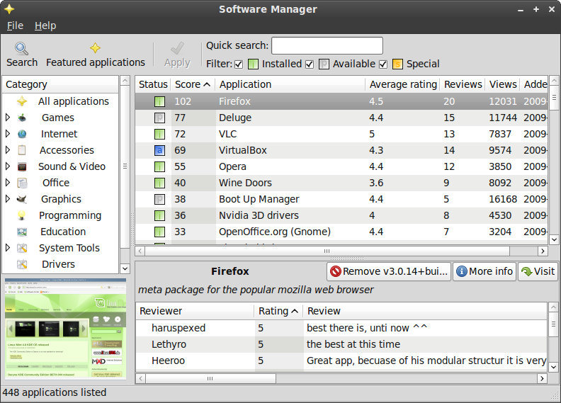
As you can see, the little colored squares indicate the status of the application. They tend to follow the aptitude classification (“i” for installed, “p” for available). Because of the nature of the Mint files, some rare ones are “special”, which means that when you install/remove them, the change is done immediately, not when you click apply.
I’m happy with the overall look but I’m aware of the fact that certain elements can be confusing, so I’m asking for feedback once again and hopefully with your bright ideas we won’t only get these great features, but also an intuitive and elegant interface to go with it.
Looks like some major improvement, and to a near-newbie, the screen looks uncluttered, informative, and easy to understand. I can’t make any suggestions, but I can say that I’m impressed.
It looks very cool! What is the filter checkbox for? Oh, wait, I just figured it out. It’s a label for the three checkboxes that follow it. That might be a little confusing. The dropdown menu that serves the same function in the Ubuntu Add Software wizard might be a better way to go (more user friendly and it cleans up that top bar).
Also, I’ve been wanting to know: how do you post a review that will show up on this thing?
I think I might be using mintInstall over Synaptic soon
I think the filter is good as it is, but the check boxes should be moved behind the icon (or perhaps the text) to not confuse. As it is now it is easy to check the wrong one. Also the header of the application (e.q. Firefox) should be left-adjusted. This would make it connect more with the image. 🙂
Otherwise it looks extremely professional!!!! Great work Clem, really great!!!!!!!!!!!!!!!!!!!!!!!!! Can’t wait for Helena! 🙂
1. I don’t know what the blue “a” means on the VirtualBox package.
2. The buttons next to the application name are too close to the window’s edge. It might be just me but I get a strange feeling seeing them as they are. Why not place them 1-2 pixels to left-down? It’s like they’re forced in that tiny place.
3. The quick search text box and the filter check-boxes should be aligned somehow. Maybe stretch the search box all the way to the left and redistribute the check-boxes for a little harmony in there.
4. Netbook people could really use a full-screen capability of this tool. If this is something you can do, give it a try. The full-screen mode wouldn’t require the title bar, the status bar AND if you place the full-screen button on the right of the toolbar, then the menu can also go bye-bye in full-screen. This really saves some space.
It looks great so far! 🙂 The drivers section would love some more action but that’s something beyond the development of mintInstall’s spawn. 🙂
I really like it. I just have one stupid question though. Do we haaaave to wait for Helena, or can I get the new and improved Mintinstall for Gloria? I’ll wait if I absolutely have to 🙁 ,just kidding. Newbies…what can you do?
OK, I’m probably just being dumb here but the GUI looks a little heavy to the left. If you were to “stack” the filter/legend to the extreme right, with the checkboxes aligned up and down (there is just enough room), then lower the quick search box (to be centred) it would balance it out just a touch and highlight the quick search box(jumps out at you). I still like it just the way it is though!!
Here is a picture of what I’m talking about, with the (remove, info, visit) buttons moved to the left just a bit.
http://i634.photobucket.com/albums/uu70/crzen/mintinstall3.png?t=1253767772
This variant looks good. Some thoughts were already mentioned above (e.g., what is blue “a”) but here are some more:
1. It would be good to show the application version. So, advanced people would know what they are going to install and if they prefer some other version (newer beta or long-tie loved oldtimer) they could install it from other place. It can look like “Firefox (v3.0.14)”
2. Version on “Remove” button looks ugly. It’s better to add one more line under the program name and show the version there.
3. The table with user reviews should be able to hide (and remember its status for all applications). It can save space and be less distractive for more advanced users who know exactly what they are going to install.
Oops, sorry to slow you down Clem ! 😀
I would probably have a few more suggestions concerning the UI, but it would cause too many headaches. As you have already planned some underlying functional changes (multi-install) I think my suggestions can be postponed for a future version, it’s probably better to take the time to fully test those new functions in order to have a stable tool for the next Mint.
It seems you are making big efforts to make your tools netbooks-compliants, do you have any estimation of the potential “market” for Mint there ?
Great!! but please can you contribute the latest stable versions of infrastructure for mint 8,,, like GTK+ 2 (not 1.2 as Gloria is) , GCC 4.41 (not 4.3.3) ,, and btw, scim 1.4.7 didn’t work with GTK 2.16
Hi there,
nice so far, but I don’t get the “i” and especially not the “p”.
Why not doing it like in ubuntu: ticked means installed, not ticked means not installed. Going from ticked to unticked means uninstall.
Changes should just be applied when clicking “apply”.
Everything else sounds very confusing to me.
You might do a notification if a newer version is available of a application that you already have installed.
Thanks
Oli
I whole-heartedly agree with Eugene about the version number being moved from the remove button to either a place in the table or as an element in the short description that appears under the table when you select it.
Hello!
I have just read the news about removing the refresh button, and using mintUpdate to download the meta package of the list every time it looks for updates. I think it’s good, but removal of the Refresh button is not the best idea – not everyone uses mintUpdate (just like me). I think the Refresh button should be left, and it should just act the same as the mintUpdate does every now and then – download / check if there’s a new list of applications – but instantly. I rarely do a system update – and always turn off the mintUpdate, so such way of solving the problem would suit me most.
What do you think about it?
Clem this is a great improvement, but I don’t see how ‘P’ standing for ‘Available’ is in line with being friendly for newbies. I’ve been using Linux for several years and I have no idea what ‘aptitude classification’ is and certainly not why P means available.
If you are going to have a letter stand for Available surely it should be A?
Belovedmonster: Agreed. What could we use instead? Another set of letters? Alternative artwork (I’d like something that looks good when it’s small, so a single letter was good).
The statuses are:
– installed (i)
– available (p)
– add (a)
– remove (r)
– special (s)
wow, thats cool ^^
I recommend just having a tick system, as symbols work much better than letters in this case.
START OFF TOPIC
Clem, when will Helena be relesed?
so to arrange a day to revise the spanish translations
END OFF TOPIC
Just a thought.
– installed (i)
– not installed/newer version (n)
– add (a)
– remove (r)
– special (s)
wow it’s very nice and easier to understand
What are we going to do regarding translations? If I use Mint in another language am I going to be totally confused by these letters? Are we going to have a different set of letters for each language?
Seems to me that symbols is the way forward.
Building on Crzen’s idea
– installed (i) | Colored green
– not installed/newer version (n) | Not installed colored gray/Newer version colored green
– add (a) | Green
– remove (r) | Red
– special (s) | Gold
I am in agreement with Eugene on the uninstall as well.
On the reviews screen I would rather see it replaced with the full description and ad the option to see reviews as a button. Sometimes I may not know the program name but want to quickly look through and see what the program does. With the current way it is very cumbersome to do so..
Why not use some symbols that people will be familiar with?
-installed (i)|Green
-available |Blank
-add (+)|Green
-remove (x)|Red
And is there really a need to list special?
If so I like the idea:
-special (s)|Yellow
I’ve seen the argument of needing to keep the “status” codes simple so as not to confuse or discourage us noobs, so why not incorperate some concepts that seem to be universal?
-installed (i) | Green
-available | Blank
-add (+) | Green
-remove (x) | Red
Is there really a need to show “special”? Because if so, there would need to be 2 codes for special:
-special installed
-special available
Just a quick thought, Mint 8 is looking great, however, mint 7 wont display 1024×768 resolution is mint 8 going to be the same, I have had to go BACK to mint 5
Phil
Just my 2 cents. Just to keep the tool bar uniform, Quick search can be in its own separator with text above and field below and the filter can be separate with Filter text in top line with the check boxes below.
This may make the quick search field smaller…
…but the current design itself looks very much appealing than the synaptic installer. Great work clem
pkh911: mint 7 displays in 1024 x 768 i’m running it in that resolution right now on my presario Compaq. You must need to do some configuring.
As far as I know most desktop distros run in any resolution, including the very tiny eeePc’s and acer Aspire resolutions.
Is anyone, anywhere, ever going to do something about the “MP BIOS bug: 8254 timer…” thingee? If you are going to tell me to use the ‘noapic’ option, or to update my BIOS, you can just…
Sorry, i lost it for awhile, i withdraw my comment.
where can i find mint 8 i use mint 6 on my laptop
Try “download Mint 8” in a Google search. What made you decide to skip the experience of Mint 7, anyway?
how much time i have to wait to download linux mint 8
and my cuestion is if i can use it on compaq cq 40 – 504 la notebook
cause the 7th version does not have audio driver it’s an high definition audio
i’m going to wait for answer